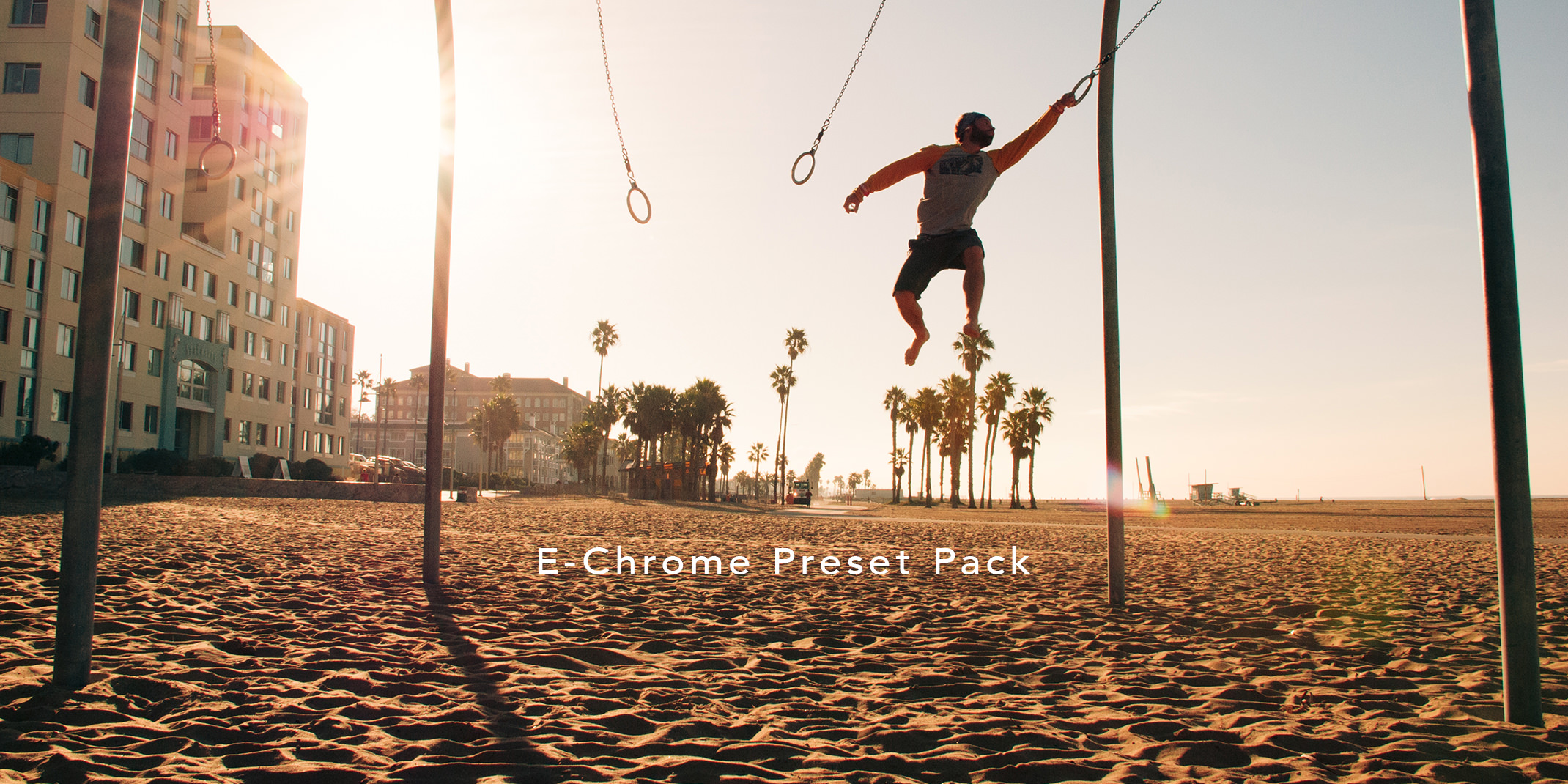
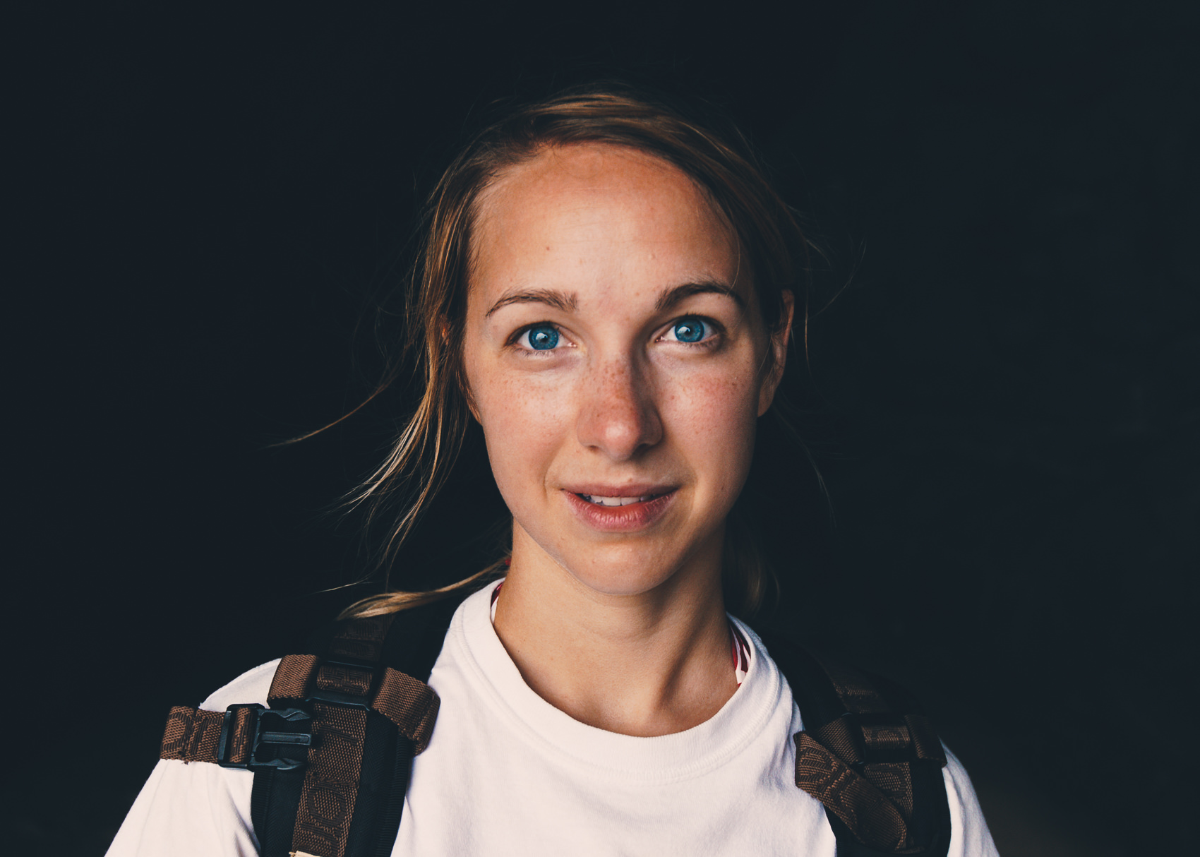
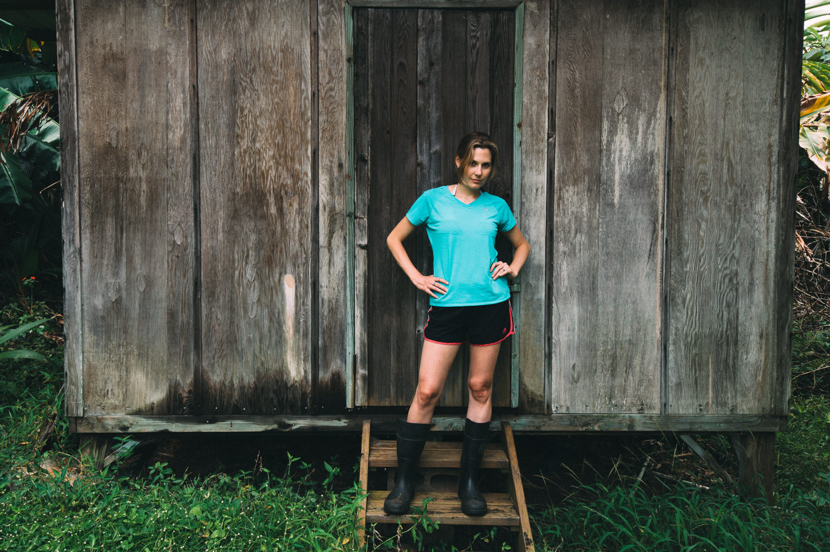
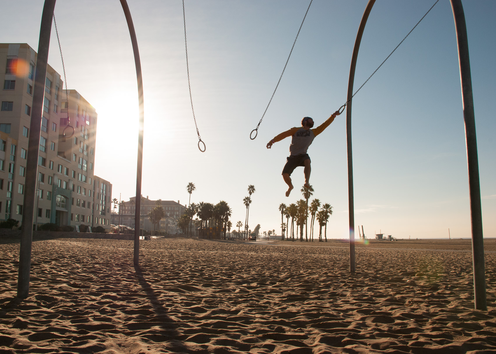
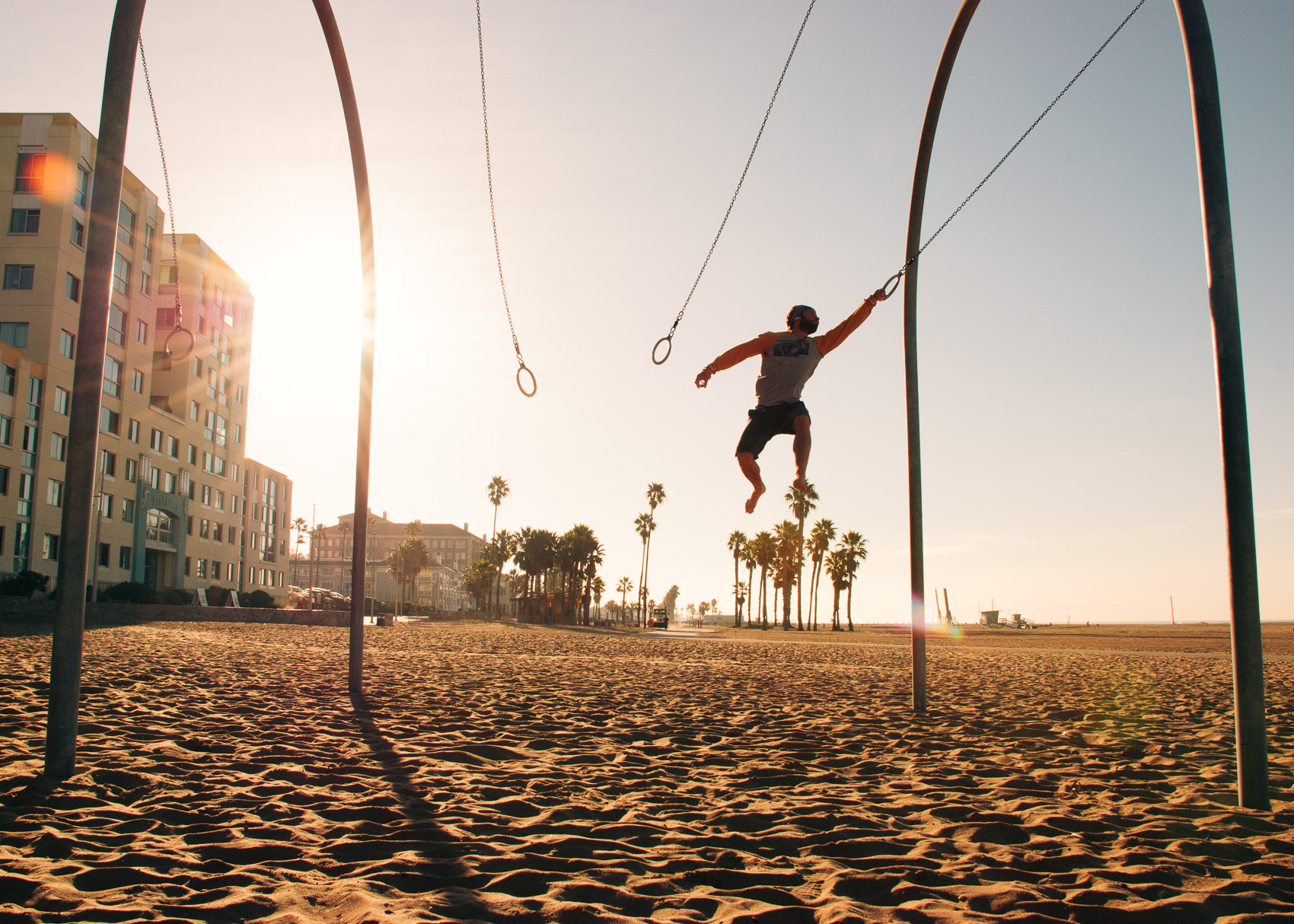
The NATE Cam E-Chrome collection captures the aesthetic of my favorite classic analog films, with gorgeous skin-tones & nostalgia-producing color palettes. From rich golden hues to cool moody vibes, you’ll be able to find presets that perfectly suits your style and takes your photos to the next level.
What makes these presets so great?
Custom Camera Calibrations for NATE Cam
To design these presets, I started by developing my own tool for building custom camera calibrations. These calibrations are part of the secret to producing consistently stunning results, no matter what digital camera you are using. Current, I’ve built custom calibrations for over 500 models of digital cameras. (Full list here).
10 All-new, Stunningly Gorgeous Preset for Lightroom
These are more than just the best presets I’ve ever made – they’re some of the best presets I’ve ever used, period. They capture what I love about classic analog film while also being styled in way that will make your photos stand out on Instagram, Flickr, 500px, or wherever you choose to share them.
- EX01 – Super Clean, Ektachrome Tones
- EX02 – AGFA-esque, with warm reds
- EX03 – Perfect Portra
- EX04 – Impossibly Warm & Moody
- EX05 – Kodak Maximus, Super Lush
- EX06 – Fuji tones, pro-grade
- EX07 – Extra Golden Kodak
- EX08 – Moody Fuji Superia
- EX09 – Washed-Out Portra
- EX10 – Cross-Processed Fuji
Better Ways To Fine-Tuning Your Look
For starters, each preset comes with 4 Different Strength variations
- Regular: 100% strength
- [–] 75% strength
- [– –] 50% strength
- [+] 125% strength
Unlike the variations of other preset manufacturers, these are accurate and consistent. It mimics the effects of blending your new image with your original image.
You can also use the all new NATE Film Toolset to make further adjustments on your image beyond the initial preset. They’re made to work particularly well with the way I’ve designed the presets.
EX01 – Super Clean, Ektachrome Tones
Overview: A super-crisp, super-clean aesthetic. If you liked the SP03 preset from the starter pack, you’ll love this preset. This aesthetic of this preset was really inspired by a set of Kodak Ektachrome analog examples I found, but with (I think) improved skin tones (Ektachrome has a tendency to produce overly-magenta skin-tones, which I’ve corrected).
Best for: This is a good preset for general use, but I particularly like it for softly-lit portraits, architecture, food photography, still-life and travel photography. If you find the full-strength version makes images a little too “hot” you can pull it back with the [–] and [– –] versions.
Before & After:
NOTE: Just use the slider on the image to see what the image looked like before and after applying the NATE Cam preset. In all of these examples, the only thing that has been changed in each image is the application of the NATE Cam preset (unless I’ve noted otherwise).

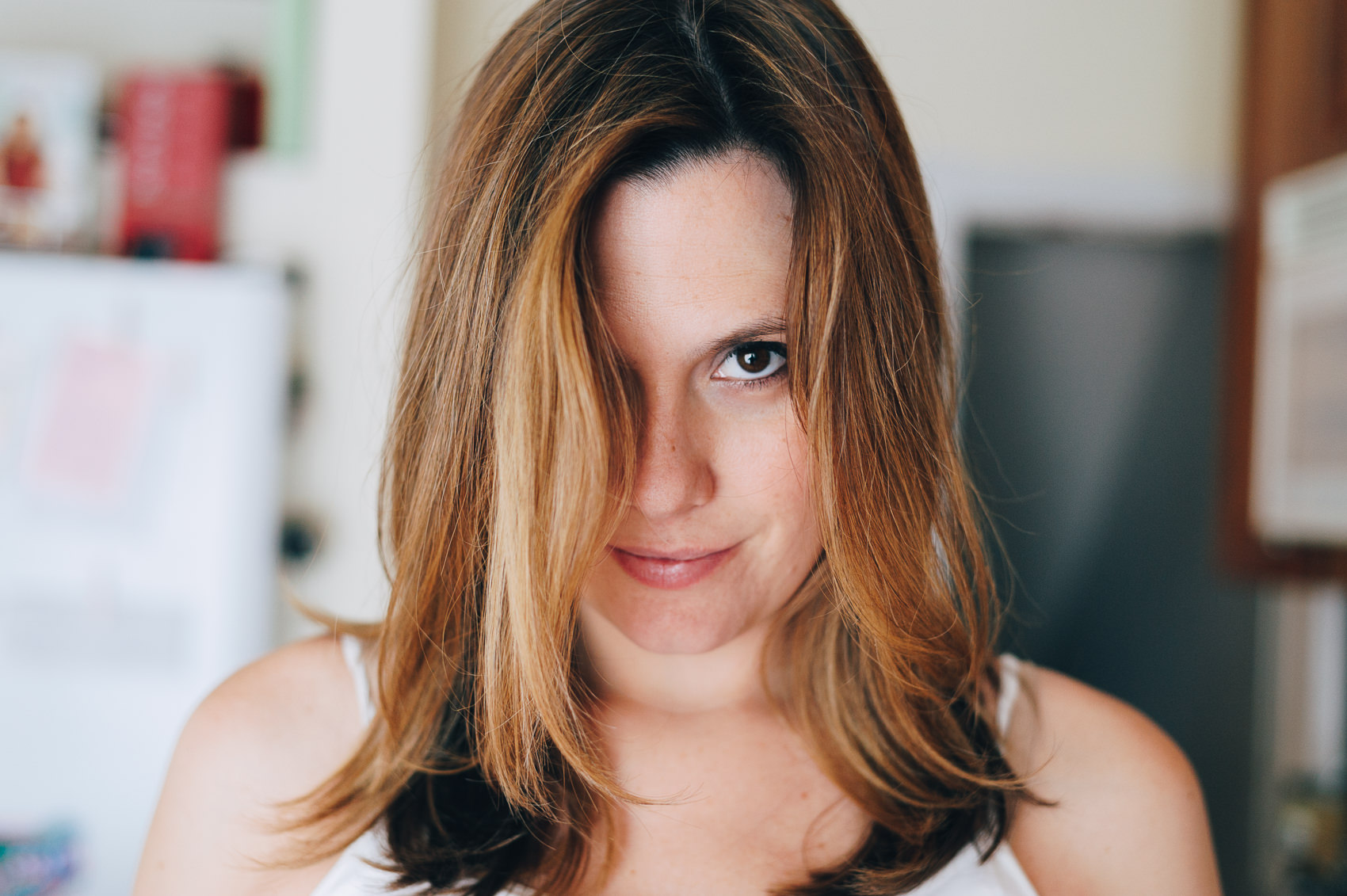
The EX01 preset really cleans this image up and gives it an added “crispness.” You can see in the before that the skin tones have an unpleasant magenta cast (which is a common issues with the Adobe Standard camera profile). The NATE Cam custom camera profiles fixes this issue and is a key part to making this preset look so great.
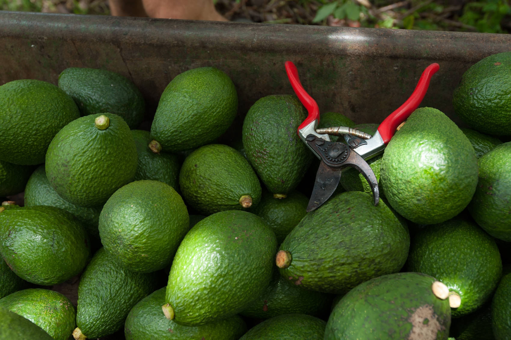

This preset produces very clean tones. It adds a slight lushness to greens and warm the reds up a bit. I’ve used the “Film Punch +” preset (from the Film Toolkit) just to make this feel a bit bolder.
EX02 – AGFA-esque, with warm reds
Overview: An Agfa-esque look with prominent red undertones. This is a very usable general preset. It produces beautiful, nostalgic tone with the smallest hint of cross-processing. Great for snapshots of all kinds.
Best for: Good general purpose consumer film-look, with warm skin tones. Looks great in sunlight or in shade. If you find that it gives your image an overly red cast, try using the [-] or [- -] variation.
Before & After:
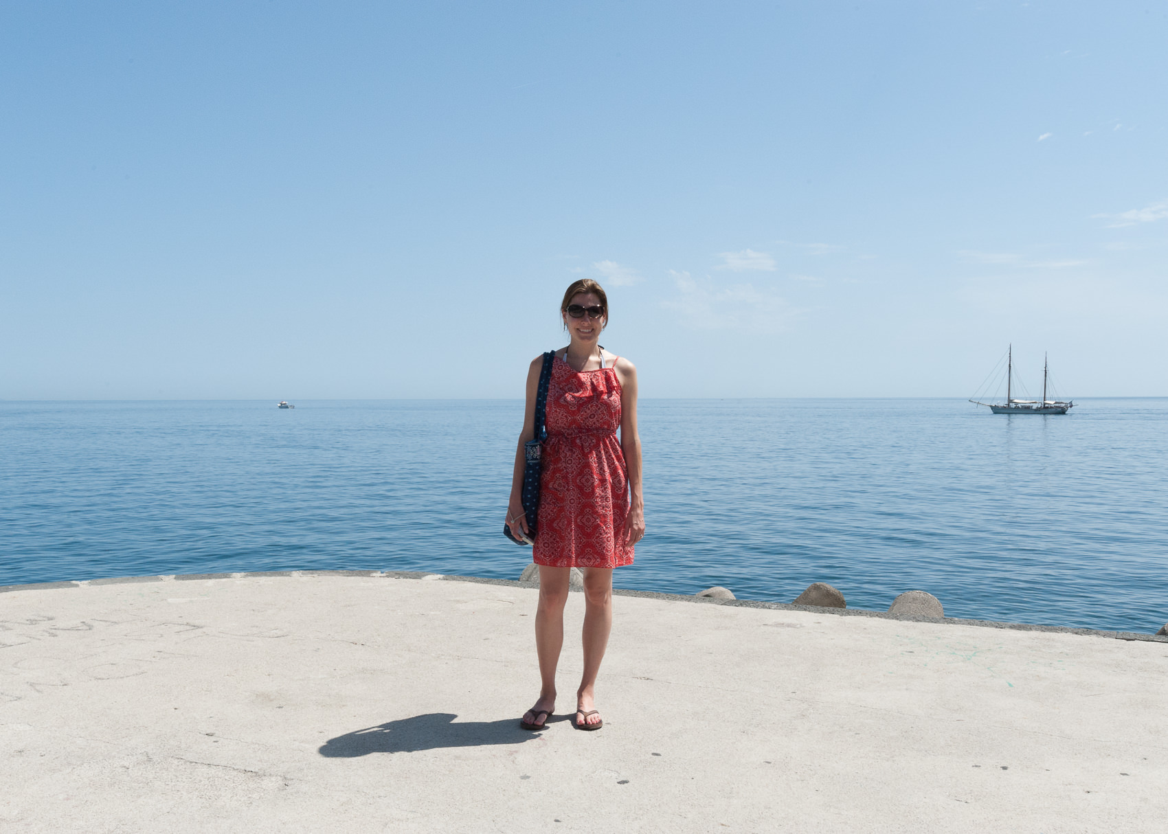

The EX02 preset has an AGFA-esque quality to it and is good for adding just a bit of consumer-film “pop” to everyday photos. It has really pleasing, warm undertones that work great in shadow or in shade.
Here’s an example from https://rawsamples.ch/, taken with a Minolta 7i. Using the custom calibrated, Nate Cam Camera Profiles helps ensure great color and tone reproduction across all camera models.
EX03 – Perfect Portra
Overview: This preset has beautiful, soft, organic feel that is similar to the effect of over-exposing Kodak Portra . Very natural skin tones with beautiful teal blues. Soft, faded shadows and highlights.
Best for: Wedding photography and child portraits
Before & After photos:


This preset really works magic on skin tones, with a soft, pastel color palette. It’s also a great option for desaturated landscapes
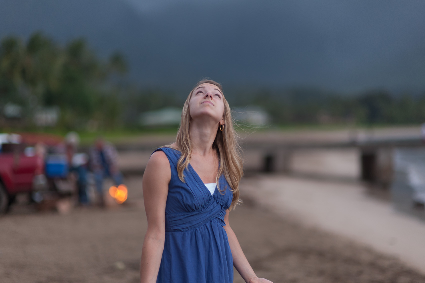
EX04 – Impossibly Warm & Moody
Overview: This is probably the most fun preset in the pack. The color palette has a strong bias towards golden orange tones, but it does it in a way that is really smooth and natural, not over-saturated but also not too muted. There’s also a good amount of fade here in both the shadows and highlights, which really enhances the moodiness of the photo.
Best for: This is a strong effect, but it can actually work well in a lot of situations. Use it on portraits when you want a “warm and dusty” look or on landscapes to create an deep, warm mood.
Before & After:
Super warm tones all the way from the shadows to the highlights. Notice how smooth the gradations are in the skin tones.
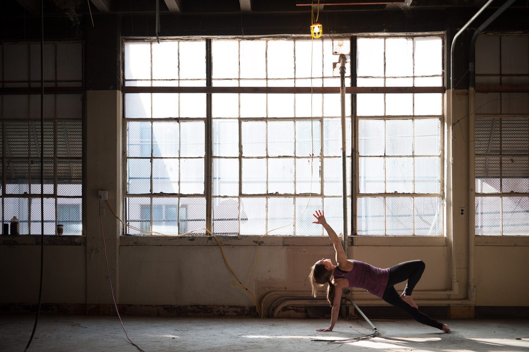
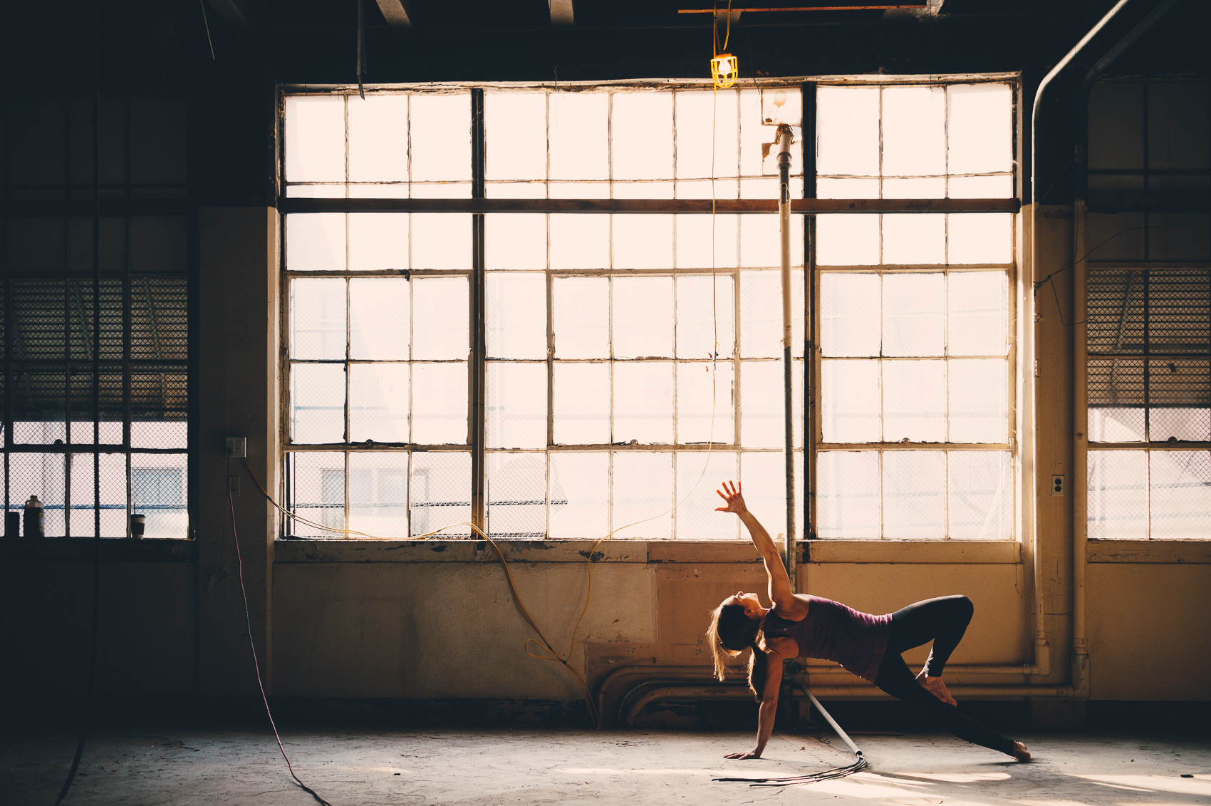
The EX04 preset really ties this shot together. It dramatically changes the feel of the scene, but still manages to seem natural and organic. I also used the “Film Punch +” filter from my Film Toolkit pack to give this photo even more drama.
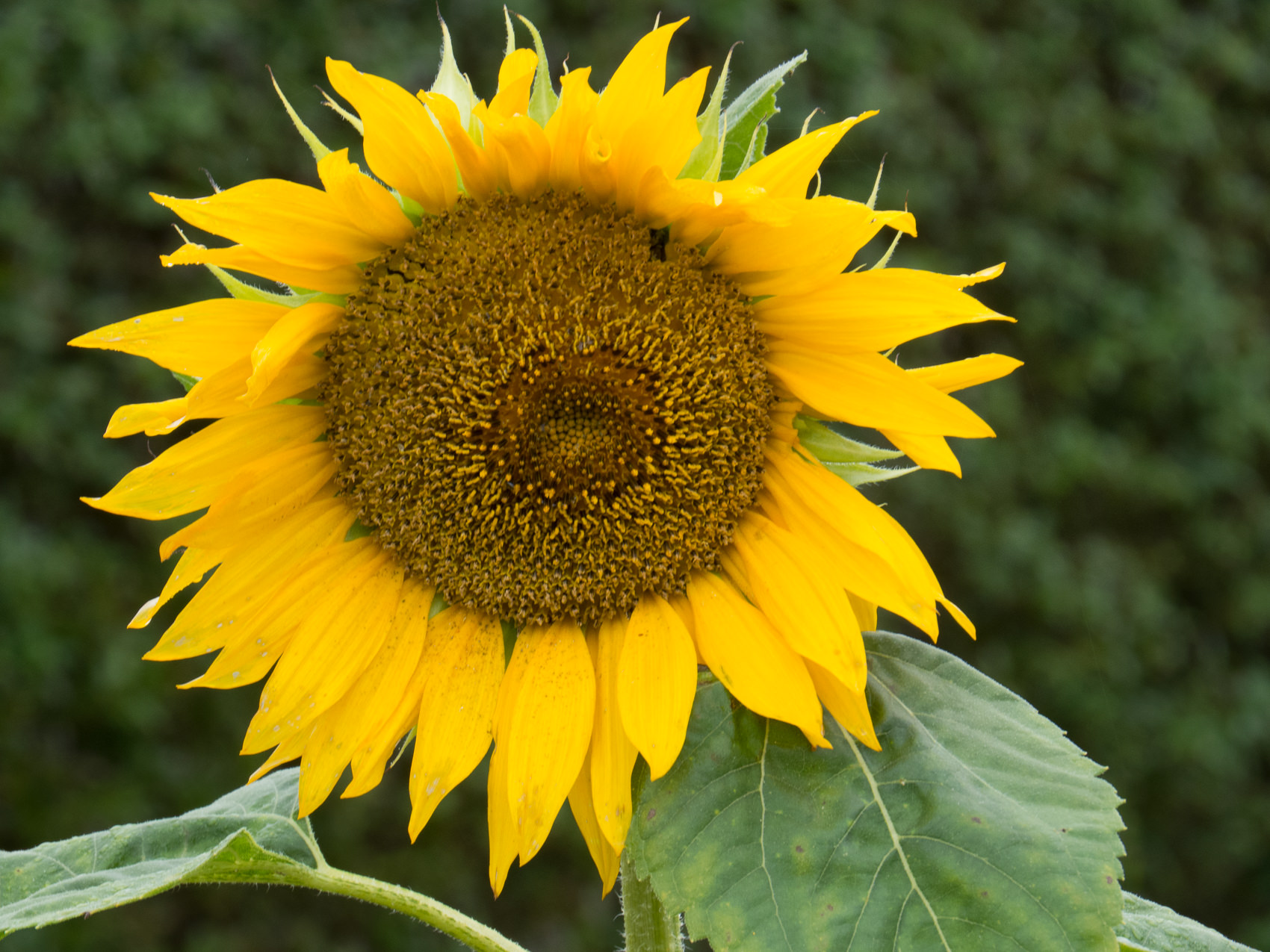
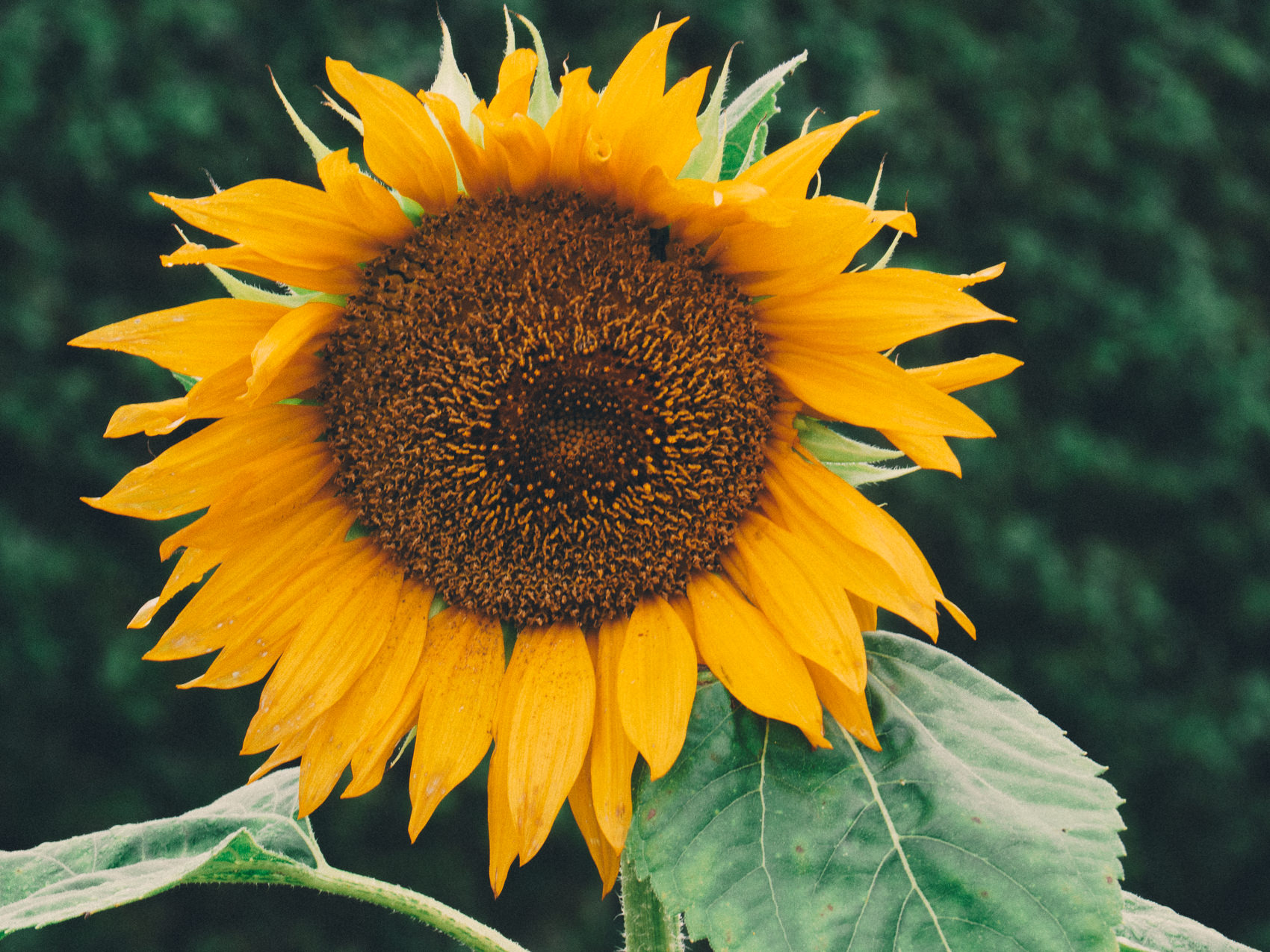
Here’s a dramatic example of the power of the NATE Cam custom camera profiles, using a photo from a Canon PowerShot raw file (via rawsamples.ch). You can see in the before just how poorly the default Adobe Standard camera profile does in rendering the nuanced, golden yellow tones of the sunflower, and there’s very little separation in hues between the yellow and green. The EX04 preset here, along with the Nate Cam custom camera profile, makes a stunning improvement to this photo with a single click.
EX05 – Kodak Maximus, Super Lush
Overview: This preset adds a gorgeous, bold style that’s reminiscent of Kodak’s consumer film. It has an exaggerated amount of “punch,” with dramatic, deep shadows, extra cool green tones, and balanced skin tones. It’s the perfect combo for really gorgeous, dramatic portraits and landscapes.
Best for: Portraits & Landscapes. Works great with light subjects against dark background. The preset will work best on photos taken in very soft light or overcast conditions.
Before & After:
Look at how much drama the EX05 preset adds to this photo. The skin tones stay perfect as the rest of the scene changes pretty dramatically to compliment the skin — with deep, detailed shadows, super lush greens, and turquoise blues. I’ve been seeing this look increasingly in fashion magazines & fashion websites, so really excited to have it here.
EX06 – Fuji tones, pro-grade
Overview: My take on Fuji professional portrait films, like 400h. Soft, warm skin tones with the perfect amount of green tinting in the shadows. This is also a popular look for fashion photography and wedding photography.
Best for: Fashion Photography, Wedding Photography
Before & After:


With the right light, this preset is pure magic! I’ve also added my “400ISO” grain filter from the Film Toolkit just to get this a more film-like look, and some pleasant depth.


EX07 – Extra Golden Kodak
Overview: Gorgeous warm glow with lots of punch. This is what Kodak Gold should look like.
Best for: Perfect for adding drama to cityscapes, especially on sun-drenched morning or afternoon shots.
Before & After:
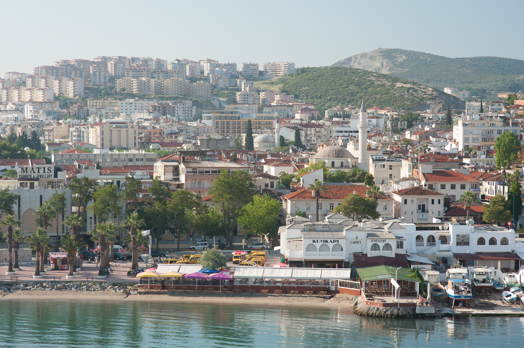

I took the shot above from a cruise ship as we were approaching Ephesus, Turkey. It didn’t really “feel” right until I used the EX07 preset. The preset really gives it that sun-drenched, arid, 110-degrees-in-the-shade feeling I was trying to capture.
I love the warmth and punch that the EX07 preset added to this shot. It really brings shots like this to life.
EX08 – Moody Fuji Superia
Overview: Cool tones with a moody vibe. Amazing for street photography.
Best for: Perfect for moody, overcast city shots and landscapes.
Before & After:


This EX08 filter add just a little bit of moodiness to city and landscape shots, particularly in soft, overcast lighting.


EX09 – Washed-Out Portra
Overview: Dreamy, washed-out tones that really adds a classic style to photos. The look is somewhere in-between the classic Portra look and a Polaroid instant-film look.
Best for: When you’re going for that warm, washed-out look, with extreme highlight fading.
Before & After:
Example above using an Olympus E-PL6 raw file from http://rawsamples.ch.

EX10 – Cross-Processed Fuji
Overview: This preset adds just the right amount of “moodiness” to a photo It has a classic fuji-esqe color pallet with subtle cross-processing effect that gives images blue/teal shadows and yellow/rosy highlights. There is also subtle fade which adds to the moodiness.
Best for: Moody portraits, city shots, landscapes.
Before & After:


The EX10 preset adds warm highlights and cool turquoise shadows, which balance each other out well. There’s also a tiny bit of fade added for a more classic look.

NATE Cam – Film Toolset
Included in this pack is my new “Film Toolset.” These were things I’ve always wished I had when manipulating my photos, and they make the 40 presets in this pack even more useful. Here’s a bit of explanation on each of them.
Film Dynamics // + // ++ // +++
The dynamic range of film is much larger than the dynamic range of digital cameras. This means that real film is often looks “softer” and “smoother” compared to digital film.
These tools help to recapture that softness in a way that is natural and pleasing. You will find these tools useful if you find that the full-strength presets are a little “harsh” or “too contrasty” for your style, or you just want to a more subtle analog film look.
Using Film Dynamics is different than using the [-] or [- -] of a given preset. Using Film Dynamics, you keep the overall effect of the preset (i.e. hue shifts, tinting, etc) and only soften the dynamic range of the image. If you want to lower the overall effects of the preset (including color shifts, etc), you should start by trying the [-] and [- -] versions.
[NOTE: Be sure to apply these presets after you’ve applied the main preset. If you change the main preset, it will overwrite the Film Dynamics settings, and you will need to apply the Film Dynamics settings again.]
Film Punch // + // ++ // +++
This preset adds intensity to your photos by carefully pulling down the blacks and shadow tones without effecting skin tones.
Even though it’s simple, I think this is one of the most useful presets in the pack and I try each level of this preset as one of the final steps in my processing flow.
The EX presets themselves are pretty neutral when it comes to punchiness. This is one of the major differences vs the previous presets I released. Depending on your camera profile, you may have found previous presets to be very intense, or very soft. Now, with custom camera calibrations, all cameras have been calibrated to a more neutral tone curve (which is a better starting point). And you can turn up the intensity if you’d like using this preset.
Film Saturation // – // + // ++ // +++
The Film Saturation presets solves a problem I had been working on for a long: how to increase saturation levels just in the shadows and highlight areas of an image.
Why would you want to do this? By default, I find that Lightroom tends to have very desaturated highlight and shadows tones. This may be what you want most of the time, but in some cases, you will want smoother more consistent saturation through the dynamic range of the image.
In Lightroom, there isn’t a direct setting to do this, but I’ve found a way that works really well (and it doesn’t involve the saturation settings at all). It basically “tricks” Lightroom into adding more saturation right where we want it.
You can also do the opposite of this and keep the mid-tones saturated, but de-saturate the highlights and shadows using the [-] version of this preset.
Grain [megapixels] // 200 // 400 // 800 // 1600
A lot of other presets offer “grain” control, but they all have a problem. Well, technically, the problem is with Lightroom itself and the way that it handles the grain effect.
In the Lightroom panel for the Grain effect, the “size” and “effect” strength don’t scale with different size images.
Let’s say you have two images. One is 12 megapixels, the other is 20 megapixels. If you apply a grain with a size of “30” to both of those images, you will see huge grain on the 12 megapixel image, and virtually no grain on the 20 megapixel. It makes a HUGE difference!
To solve this, I’ve calibrated the grain size and strength for three different megapixel ranges: 10-15MP, 15-20MP, 20-30MP.
So for instance, say you’re lucky enough to be shooting with a Nikon D5, and you want to replicate the approximate grain from a 400 ISO analog film. You would just select “Grain [20-30MP] – 400 ISO”.
Or, if like me you are sadly still shooting with an older model that is just 12 megapixels, you would select “Grain [10-15MP] – 400 ISO.”
Fade // 01 // 02 // 03 // 04 // 05 // 06 // 07 // 08 // 09 // 10
Adding fade via an RGB curve is pretty easy. But doing it predictably is all but impossible, because those damn tiny points on the curve are so sensitive and difficult to control.
So this is simply a predictable, pre-built way for you to add very precise fade to your images.
And because my presets make the vast majority of their curve adjustments in the channel specific curves, the fade will truly be on top of the existing preset (and not messing up an existing curve – which is something that isn’t true with VSCO Film).