Welcome to part 2 of the Advanced Lightroom Series!
In part one, we looked at the #1 Lightroom Editing Mistake – which explains why so many photographers struggle in Lightroom to get the styles they want in their photos. Without the right strategy, most photographers end up using a "trial and error" approach to editing that takes way too much time and leads to poor editing results.
So in this post, I want to reframe the way you approach Lightroom (and post-processing in general). I'm going to give you a strategy that will help you break down the styles you actually want to achieve in your photo editing with Lightroom.
Because before you can understand Lightroom's tools, you have to understand the elements of style in post-processing.
Just think about it. What good is knowing what tone curves do without knowing what exactly it is we want to be done with them?
This is something I see other courses and youtube videos getting wrong all the time. They don't have a framework for approaching Lightroom (or analyzing style), and so they actually teach you the bad habit of fiddling with settings until you get something that looks OK.
"The 4 Building Blocks of Style" is the framework I built after years of analyzing analog film attributes, and it's part of the secret to the styles I'm able to build in my NATE Cam Lightroom Presets.
I made this video to show you what this process looks like in Lightroom, as I develop a brand new preset from scratch. So watch this now...
... and then you can read below for more explanation.
Why are the 4 Building Blocks of Style so important?
Like we discussed in the last post, Lightroom has over 97 different knobs to adjust. Without a strategy, it's only natural we fall into the trap of "fiddling around" with settings (and end up disappointed with our editing results).
But with the 4 Building Blocks of Style, editing will become simpler and more effective. How?
- Instead of worrying about 97 different settings, we'll focus on just 4 key editing areas.
- Instead of adjusting settings from top to bottom (or randomly), we'll do it in an order that gets us more consistent results.
- Instead of just having a vague idea of the edits we want, we'll know exactly how to get the look we're envisioning.
Because here's the secret:
There are only 4 types of edits you can make to your image...
That's right. Each of Lightroom's 97 settings can fit into one of these 4 categories). Every preset you own, every editing style you envision, every analog film – they can all be described (and recreated) using just these four building blocks.
1. The Tones
2. The Color Cast
3. The Color Palette
4. The Details
That's really all there is to it. The more you're able to SEE & CONTROL each of these 4 building blocks, the greater your Lightroom powers will become.
It's also worth noting that the order of these building blocks is intentional. It's like building a house. You start with the BIG stuff first (like the foundation and the structure) and only after those are up do you start putting the finishing touches on the interior.
Ok, so let's look closer at the first building block:
1. THE TONES
The tones are the foundation of the image. Without the right tones, nothing else matters. The right tones can make your photo come to life. You can use tones to make your photo feel punchy, striking, soft, faded, gloomy, bright,... really whatever you want.
TIP: I put the photo above in black & white mode while I edited so I could really see the tones – undistracted by color. I almost always do this. You should try this (just hit "v" while you're editing to flip into b&w mode). It's SO much easier to see the tones this way because color impacts our perception of brightness.
The tones are just how you choose to render the brightness of the light (and darkness of the shadows) in the scene. It's less about having "right or wrong" tones and more about the effect you want to achieve.
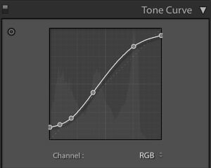
Here, I wanted something that felt like a classic photo from Paul Strand, with super-deep shadows that have a matte-like finish, and glowing highlights that never surpass a "slightly textured" white. (Don't worry if that doesn't make sense yet).
The tools you need to master tones in Lightroom are:
- The RGB Tone Curve --> This is where you want the bulk of your tonal adjustments coming from. It is just SO powerful.
- The Region Slider --> Great for simpler tonal tweaks.
- The Basic Panel --> Great for recovering highlight and shadow detail (careful not to go overboard) and for overall exposure setting.
Learning how to use the RGB curve is a crucial skill to having control over your tones. So we'll talk soon about where and how to place your points, depending on the effects you want to achieve!
2. THE COLOR CAST
Color Casting is the most misunderstood part of the development process. It's something many photographers miss entirely (or don't even recognize that they are trying to achieve). With the right color cast, you can make your images feel: warm, cozy, cold, foreboding, nostalgic, moody... and in the process, your photos will look more distinctive and consistent.
TIP: A clear sign you're using color casting wrong is that you're trying to do too much with the White Balance tool. The White Balance tool is great for getting to a neutral color balance (grey cards are awesome for this), but the moment you start trying to add a color cast with this tool (like extra warmth or coolness) you're going to lose control and consistency. Instead, try to get a neutral "white balance" and then use the individual R/G/B tools to add the specific color cast you want.
Can you see that the brightest parts of the image above aren't pure white anymore, but instead have a little yellow in them? Also, see how the darkest parts of the image aren't pure black, but instead have a slight greenish tint? That's color casting.
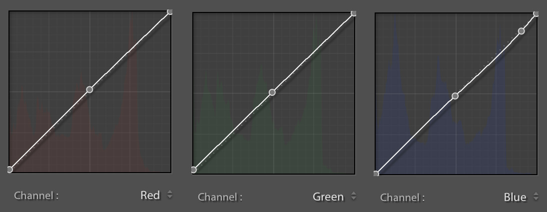
Above are the adjustments I made. It's just a tiny adjustment (no more than ~2% change anywhere on the individual R/G/B curve), but it still has a major impact on the mood of the photo.
There is so much amazing stuff you can do with color casting once you start to recognize it. It's a major part of the most "sought-after" preset looks (including almost all of my own NATE Cam Presets). And if you want to build your own looks (or more effectively "tweak" your presets) you have to understand how to do this.
The main tools in Lightroom for adding color casts are:
- The individual R/G/B Curves --> this is by far the best tool for adding color casts. Once you know how, there really is nothing you can't do with this tool.
- The Split Toning Tool --> pretty easy to use, but very limited in its abilities (compared to individual R/G/B curves).
- The White Balance Slider --> Like I mentioned above, a lot of photographers run into trouble trying to do too much with this tool. My recommendation is use white balance to get as close to neutral color as possible (i.e. no color cast). Then add your color cast to it using the individual R/G/B curves and you'll get more consistent, repeatable results.
The individual R/G/B curves are the single most powerful tool in Lightroom. When used properly with the main RGB curve, there's no limit to the processing styles you can achieve. There is a LOT to learn about how to use this tool, so I'll talk more about HOW you can learn to use it in the future.
3. THE COLOR PALETTE
Designing the Color Palette is like decorating the interior of a house. We only start to adjust it AFTER the foundation is laid (tone curves) and the walls are up (color casting). Knowing how to design a color palette, you can achieve any color effect you want... clear luminous skin or golden textured skin, dry arid landscapes or lush landscapes, deeply saturated skies or bright washed-out skies... and you can learn how to use color theory to make the subject in your photos stand out.
TIP: My first goal with the color palette is to make blemishes less noticeable and make the skin more golden and even. To do this, I move the Red Hue more towards Orange (the main color of skin). Second, I want to bring more attention to the subject, so I bring down the luminance and reduce the saturation of the Blue hue in the jeans. This makes the skin tones "pop" and really become the star of the scene.
The two biggest mistakes I see photographers make with color palettes are 1) obsessing over "correct" color (which is rarely the goal - unless you're doing product photography) and 2) not knowing where to begin in the HSL panel, since there are so many options.
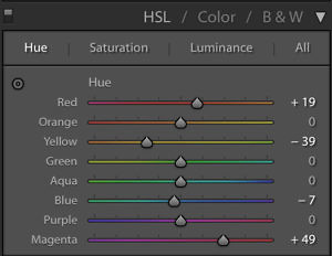
The secret is to always start with one of the 3 crucial hues (skin, sky or foliage) depending on the subject matter, and then use a process I call "Goal-Based Palette Design" to make decisions from there (more on that soon).
There are two main tools in Lightroom for building color palettes:
- The HSL Panel - An amazing and versatile tool for developing color palettes, especially once you understand the color theory behind it.
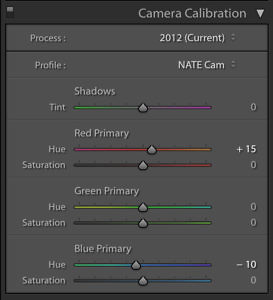
- The Red, Green & Blue Primaries - A more complex tool that changes the interaction between the three primary colors (if you're interested in learning about this, watch my Lightroom Tutorial on the Red Green & Blue Primaries).
4. THE DETAILS
Now that we have the photo 95% where we want it, only now do we start thinking about fine-tuning the details. These are the tiny adjustments that can take our photos to the next level, like film-like grain, softer skin, clearer landscape details, eye-catching vignettes... oftentimes these are the little things that can take your photo from "good" to "great."
TIP: It may be difficult to really see any difference above but I've done three small things that make me more satisfied with the result. First, I've used the Adjustment Brush to remove clarity from the baby's skin, which makes it feel softer. And second, I've used the Graduated Filter to slightly darken the corners of the image, making the baby's skin appear even more luminous. And third, I've added just a touch of grain to match the classic film look of this edit.
There are lots of tools in Lightroom that can be used for details, but here are a few of the most common uses:
- Clarity - Add or remove "micro-contrast" that will make landscapes feel more detailed. But it will leave artifacts on edges if you overdo it, so be careful.
- Dehaze - Make objects in distance feel clearer by removing the "haze" caused by light reflecting off water particles in the air. Another great detail adjustment for landscapes.
- Grain - Makes photos feel more organic and "film-like" when used properly.
- Adjustment Brush - A powerful tool for applying changes to just portions of an image. The two most common uses are 1) lowering the clarity of skin (to make it feel softer) and 2) selectively removing saturation (to leave just one dominant color in the scene).
- Gradient Filter - Awesome for selectively lowering the exposure of portions of the photos.
- Vignette - Useful for drawing the viewers eyes towards the center of photo.
This is a broader topic, and there's lots of possibilities. The key is to ask yourself: "What else can I do to enhance my subject, or remove distractions from my subject?" Become familiar with a few of the most common uses above. You'll grow your toolset, and over time, it will become more apparent which detail adjustments you need to make at the end.
Practical Notes
Ok, obviously this process isn't something that you need to apply from scratch for every photo. So here are a couple of practical things to keep in mind.
1. Once you have a "style" you like, you can copy/paste to other photos (or create your own preset)
Lightroom makes it incredibly easy to re-apply the same styles again and again. You can copy & paste styles (using "command c" and "command v") between photos. When you do, just make sure that you select the appropriate settings to transfer. My "copy settings" usually looks like this:
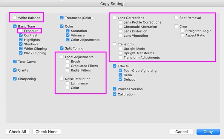
Notice what I'm NOT copying over: the exposure, the white balance, local adjustments, noise reductions, and a few other items. This may change slightly depending the situation, but in general, you don't want to copy over things that you would want to do independently per photo.
You can also save your settings as a "preset", which will bring up a similar dialogue box where you select which settings to save.
Here are a few examples of just applying the preset I developed for the original image:
Now that I have that style, I can apply it quickly to whatever I want.
2. You can use the 4 Build Blocks to determine how to adjust existing presets
Chances are you are already using some Lightroom presets. If there are some that you like, but are still just a bit off from your taste, there's no need to rebuild everything from scratch. Just go through the 4 Building Blocks and determine what it is that is missing.
Start with the tones... take your image to black and white (hitting "v"). Are the tones where you want them? Could they use some tweaking? Then go on through the color cast, the color palette, and finally, the details.
With a little practice, this will make it so much easier to spot exactly what tweaks you need to make to get the look you want.
Up Next...
Whew! So those are the 4 Building Blocks of Style. 🙂
Obviously, there is still a LOT more to learn and apply.
So in the next lesson, we're going to start looking at the 3 Rules of Tone Curves, and how you can use use them to start developing the tones you want in your images.
And if you have any questions or comments, again, just let me know below!
Cheers,
-Nate











Excelent blog, Nate. It has helped me so much. I’m stillmwaiting for the rest of the VSCO pack guides 😉
Great work Nate! Can’t wait for the next part.
I love your work! Keep it up, Nate. Learning a lot from you 🙂
Hi Nate, I found your website and have been engrossed ever since! I love how you break the process down especially with the before and after slide photos. I can’t wait to learn more on how to improve my editing as reading your site I realise I rely too heavily on the basic sliders and make some severe adjustments and I need to learn to use more finesse with the aspects you talk about. Can’t wait for you to give us an insight into how to really use the tone curves rather than just the fairly typical S shape rgb! Thank you so much!
My instagram is @nspixx if you have time I’d love to hear your feedback on my photos / editing.
Kind regards,
Nick
Thanks Nick! Great to hear that this has been helpful!
Cheers,
-Nate
Seriously helpful and organized notes. When will you have the next video up? I’m really looking forward!
I just found your site and i’m So happy! When will the next tone curve come out?
I just found your website and Im so glad I did, I just apply the right order to develop my captures and what a difference! I also studied your guide about primary colors and it was Amazing! Can’t wait for the next 3,4,5,6 modules! Thank you so much.
Nate really excellent work. Any way to get a copy of the goal based palette design chart to throw on the wall of my work station?
This is great insight, even until today. What happened to the succeeding parts? Such a shame if you’ve stopped at part 2