Whether you’ve spent years in a darkroom or you just got your first digital camera, this guide will show how to use X-Chrome to develop incredible black and white photos in Lightroom.
X-Chrome works differently than other Lightroom presets you may be used to. It’s more than a single set of presets. Instead, it gives you the building blocks of the darkroom process and let’s YOU chose how to arrange them.
This is what makes it so powerful.
But of course, this can also make it intimidating. The “trial and error” approach of using a preset pack can only take you so far.
That’s what this guide is for: to help you unlock the full power of X-Chrome in your Lightroom workflow.
Jump to a section:
Buckle up, because we’re going deep into the rabbit hole…
The Overall Strategy
Before getting into the details of each of the presets, it’s important to understand the general strategy. (Yes, there is a strategy to all this!)
The presets in X-Chrome are intended to be applied in the SAME ORDER as you would in a darkroom:
1. Film Selection → 2. Developer Selection → 3. Paper Selection
Just like in a darkroom, each stage refines your photo further. And to make each of these decisions, you just have to ask a few key questions:
1. Film Selection: This sets the foundation for your look.
– Do you want a “gritty” or “refined” look?
– Do you want higher-contrast or lower contrast?
2. Developer Selection: This refines the tonal balance
– Do you want low-key tones, high-key tones, or balanced tones?
– Do you want detailed or obscured shadows and highlights?
3. Paper Selection: This adds character & personality
– Do you want tint? Warm or cool? How much?
– Do you want paper to be light or heavy? Glossy or matte?
Not necessarily. If you’ve set your exposure properly, you should be good to go. If you know your exposure is off, you can adjust this before applying the presets if you’d like (but you may need to adjust it again after selecting your film). If you like to use Lightroom’s Lens Correction, you can also go ahead and use this before starting (X-Chrome won’t change this).
Ok, so let’s move on to learn about the Pre-Mixes…
00. The Pre-Mixes
When you install X-Chrome, I’ve included a number of pre-mixed recipes. This is a great way to “dip your toes” into X-Chrome and get a taste of what it can do.
You can also use these premixes as a starting point for further refinement, especially if there is a look in here that you already like.
So, say for instance that you like the look of X1, but want to try it on different papers. No problem. Just click X1, then try it out with different papers.
Here’s the list of pre-mixed “recipes”:
X1
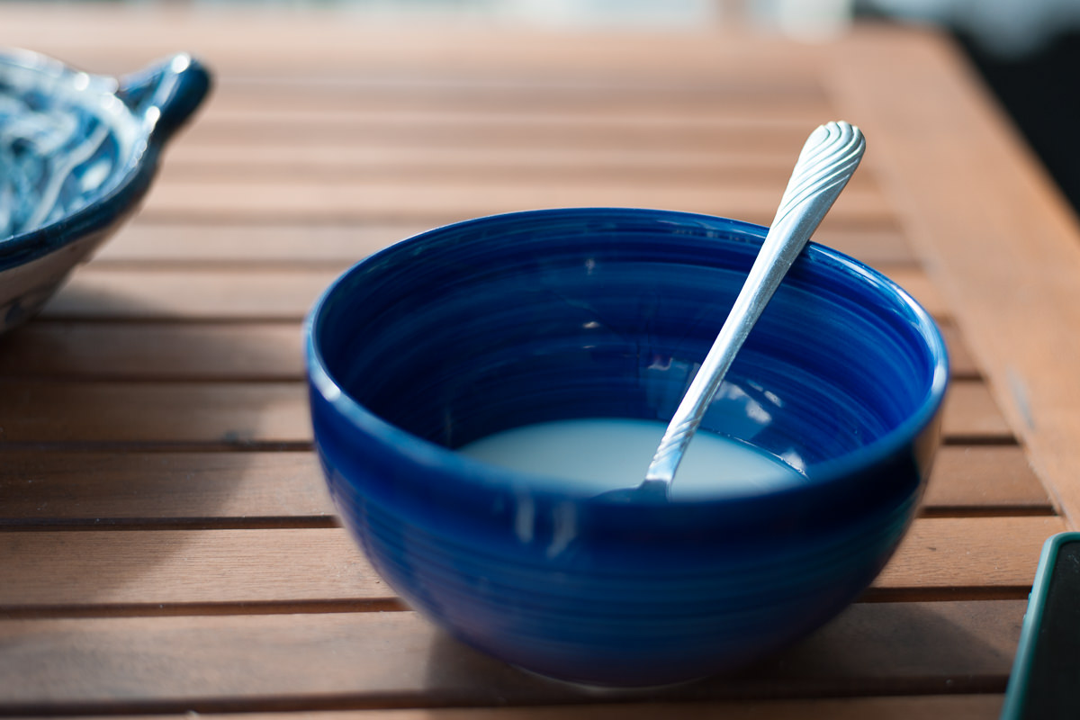
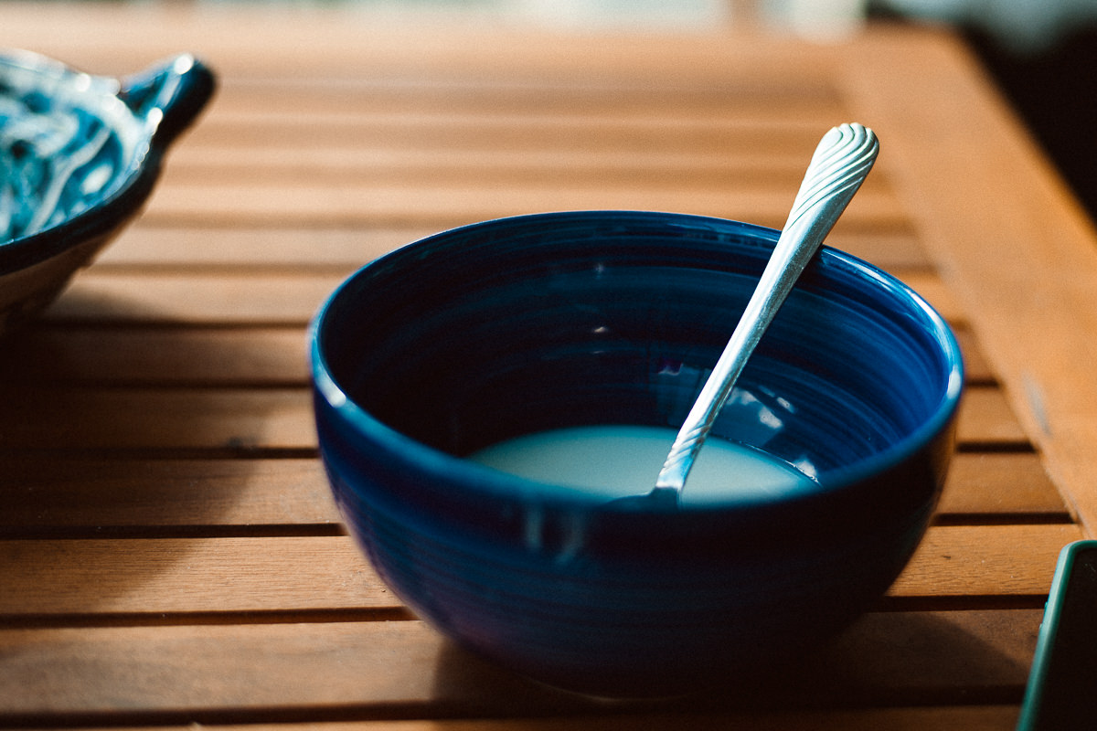
The LEFT side of the slider is the before image. The RIGHT side is after applying the settings.
RECIPE: HP5+ 1600 // HC-110 // Selenium #2
Medium high contrast & grit // deep shadows // greenish-yellow tinting with matte-finish.
X2

RECIPE: Tri-X 6400 // XTOL 1/2 // Warmtone Matte
Intense contrast and grit // warm tinting with matte finish
X3


RECIPE: Tri-X 800 // XTOL Bright // Cooltone [-]
Medium contrast & grit // extra bright tones // slight blue tinting
X4
RECIPE: Tri-X 400 // XTOL // Fade 4 // Color Contrast
Medium contrast and grit // extra fade and color contrast
X5


RECIPE: Polaroid Type-55 // HC-110 1/2 // Fine Art Photo Rag Natural
Medium contrast with refined detailed // slightly darkened shadows // very slight warming with tonal whites
X6
RECIPE: Tri-X 1600 // HC-110 // Copper & Iron
Medium high contrast & grit // deepened shadows // red highlights with cyan shadows
X7

RECIPE: HP5+ 400 // HC-110 // Cooltone [-]
Medium contrast & grit // slightly deepened shadows // slight blue toning
X8

RECIPE: HP5+ 3200 // Rodinal 1/2 // Selenium #3
High contrast and grit // balanced tones with enhanced acuity // high matte and yellowish-green tinting
X9

RECIPE: Neopan (push) // XTOL // Fomatone
High contrast and high acuity // clean modern tones // strong golden tint
X10
RECIPE: Polaroid Type 55 // XTOL // Selenium #1
Medium high contrast & acuity // bright modern tones // glossy finish with warm highlights and cool shadows
X11


RECIPE: HP5+ 400 // HC-110 // Fine Art Photo Rag Natural // (color) – Portra-fy
Medium contrast and grit // deepened shadows // slight warm tinting with softened highlights // soft pastel colors
X12


RECIPE: Tri-X 800 // HC-110 // Ilford Warmtone // (color) Potra-fy
Medium high contrast and grit // deepened shadows // warm undertones // soft pastel colors
X13
RECIPE: Neopan 100 // HC-110 // Fomatone // (color) Portra-fy
Medium contrast and acuity // deepened shadows // extreme warm tinting // soft pastel colors
X14

RECIPE: Polaroid Type 55 // XTOL // Neutral Glossy // (color) Kodachromify
Medium contrast and acuity // clean modern tones // rich colors
X15
RECIPE: Polaroid Type 55 // HC-110 // Kodak Brown Toner [-] // (color) Kodachromify
Medium contrast and acuity // deepened shadows // brown undertones // rich colors
01. The Films
The film is the foundation of your style. It determines the contrast profile and the “grittiness” of your photo.
Here is how the films in X-Chrome compare in terms of contrast and grittiness:
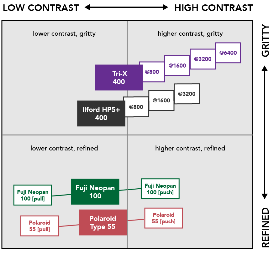
So, for instance, you can see that Tri-X @ 6400 has extremely high contrast and grit. On the other hand, Polaroid 55 [pull] has very low contrast and is more refined.
What does “push / pull” mean?
Pushing film means that the development time was longer than typical (leading to higher contrast). Pulling film means that developer time was shorter than typical (leading to lower contrast). It’s assumed in both cases though that the film was shot at box speed (meaning exposure was correct).
What does the @ symbol mean?
Where the @ symbol is used, it means that the film was “rated” for a higher speed during shooting, and then processed accordingly for that higher speed. This is a common practice for 400 ISO films, like Tri-X and HP5+. So for instance, if you shot Tri-X 400 @ 1600, you would underexpose by 2 stops when shooting, and then develop longer in the lab. This leads to both increased contrast, and increased “grittiness.”
By default, the presets in X-Chrome include grain. If you prefer your photos without grain, you can use the “GRAIN OFF” settings. Once you click this, the grain will continue to be OFF for that individual photo, even as you apply other presets from the pack. If you decide to turn the grain back on, it will use the correct grain from your latest settings. Nifty.
Let’s look closer at the films…
Fuji Neopan 100 // pull // push
Great for: Fine-art Photography, Architectural Photography, Portrait Photography

RIGHT: Neopan 100 [push]
Usage Notes:
- Produces beautifully even tones with smooth tonality throughout
- Very minimal grain
- Lots of dynamic range (especially when using the “pull” variation)
- The regular version may appear “flat” when used on low contrast scenes, in which case you will want to use the “push” variation (or manually adjust contrast)
Ilford HP5+ 400 // 800 // 1600 // 3200
Great for: Street Photography, Documentary Photography
RIGHT: HP5+ @ 1600
Usage Notes:
- Less contrast and less grain than Tri-X, but still with some of the gritty characteristic of a street film.
- Handle pushing to higher ISO really well – maintaining details better than Tri-X (probably because it starts off with a little more room for contrast).
- Photographers rave about how this film at higher ISO – many prefer it at 1600 vs 400.
Kodak Tri-X 400 // 800 // 1600 // 3200 // 6400
Great for: Classic Black and White Look, Street Photography, Gritty Documentary Photography
RIGHT: Tri-X @ 3200
Usage Notes:
- This has been the “go to” film for street photographer for decades
- Classic, High contrast look (even at 400)
- Rough and gritty look, especially when pushed
Polaroid Type 55 // pull // push
Great for: Landscape Photography, Documentary Photography
RIGHT: Polaroid Type 55 [push]
Usage Notes:
- This was one of Ansel Adams favorite films – used often in large format. It would produce a positive (for preview) and negative (for development) at the same time.
- Incredible acuity and definition
- Smooth tonality with a bit more depth and drama than Neopan
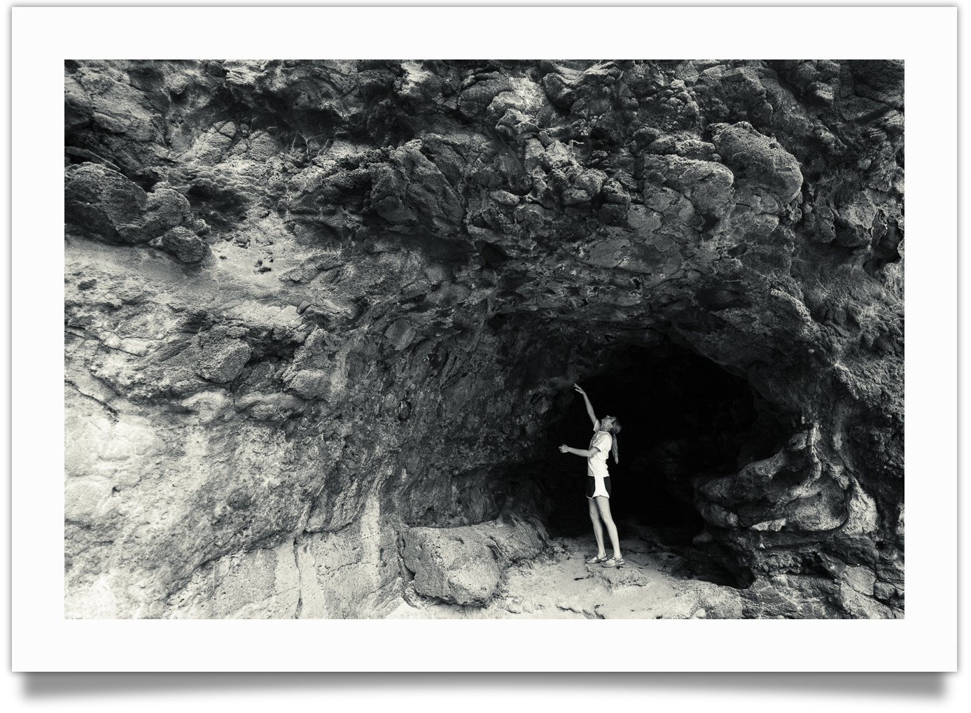
02. The Developers
The developer refines the tonality of your photo.
It interacts with the film itself, so the effects of the developer can range from something subtle to something dramatic.
For X-Chrome I’ve included three different developers, based on the kinds of tonalities they enhance:
- Afga Rodinal → Classic, detailed & balanced
- Kodak HC-110 → Rich, dramatic blacks (my personal favorite)
- Kodak XTOL → Clean, modern, bright
Let’s look closer at each of these…
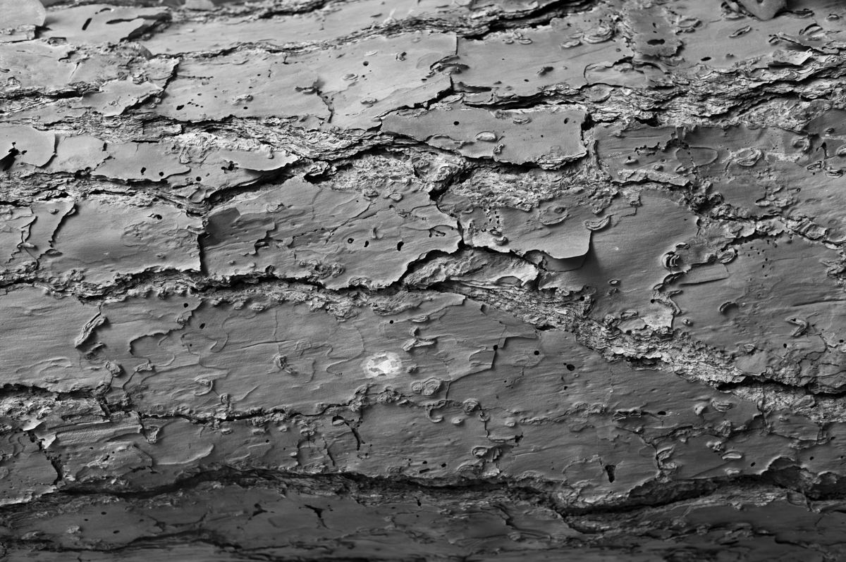
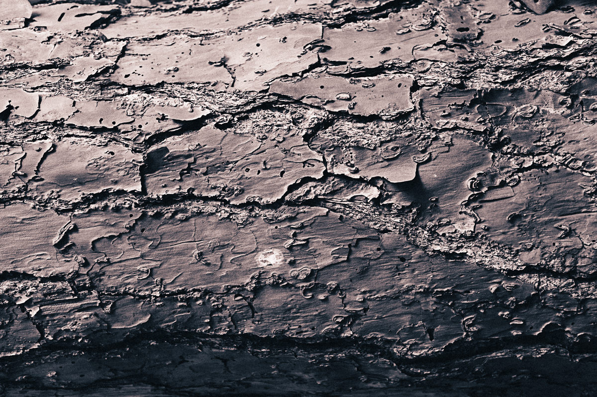
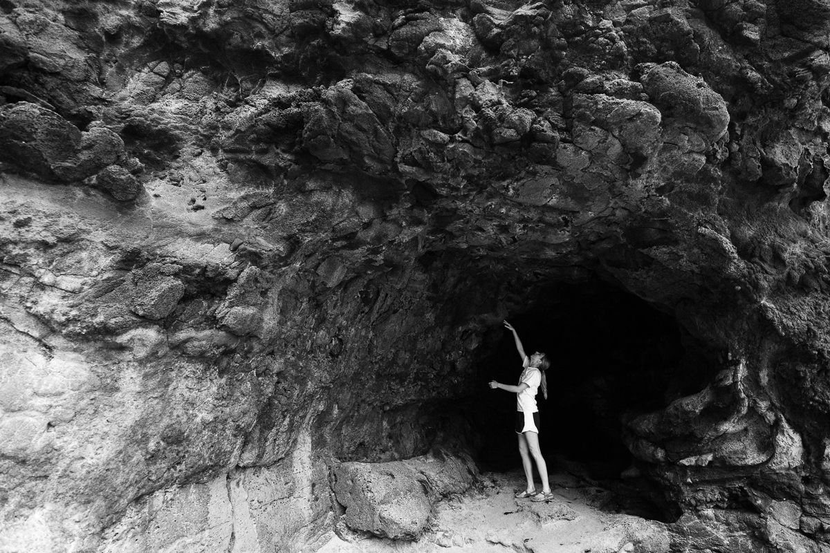
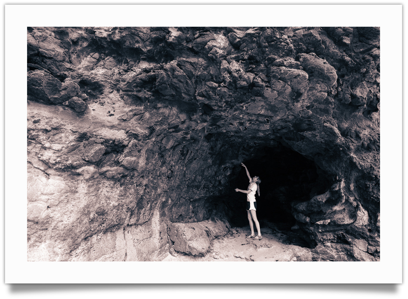
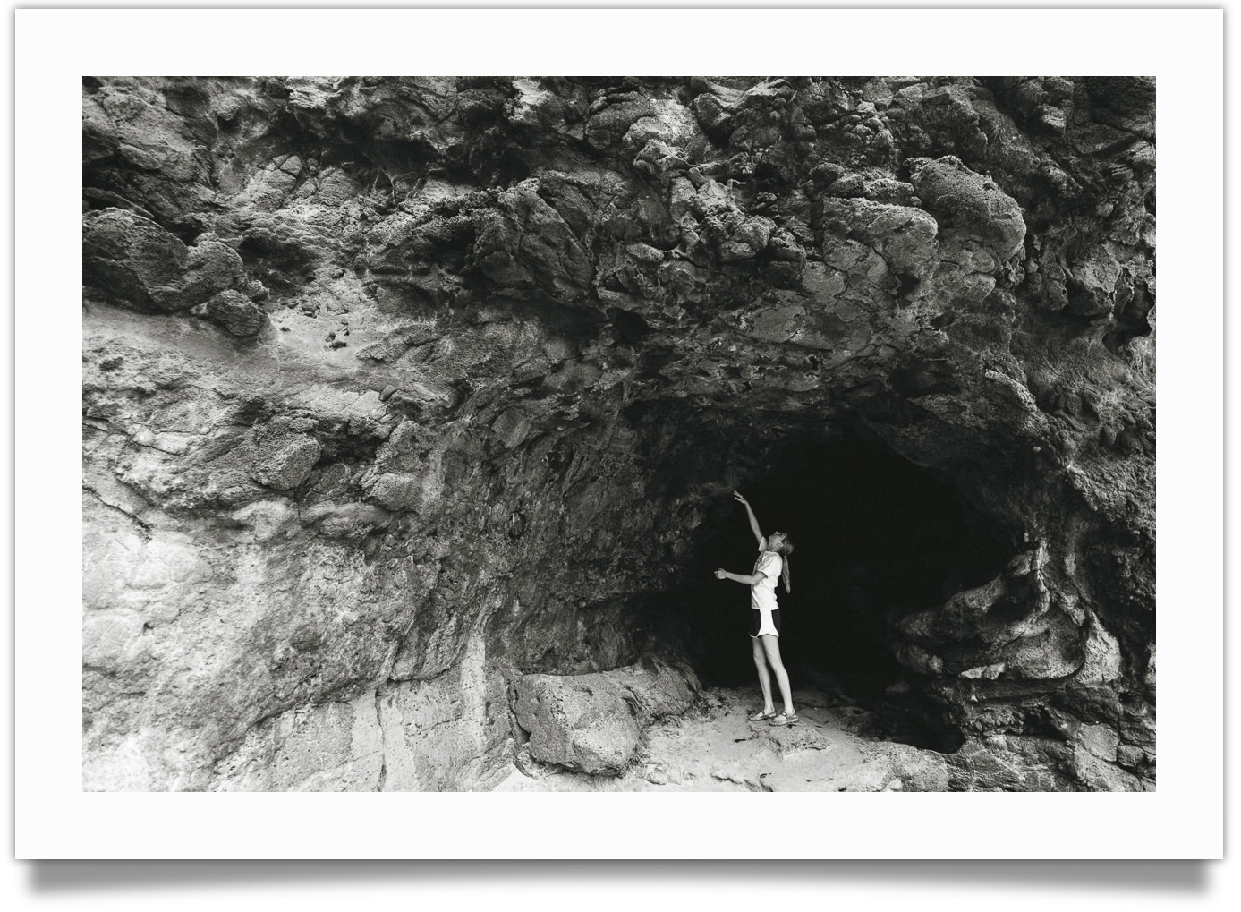
Agfa Rodinal
Best for: Even, classic tones (think Vivian Maier)

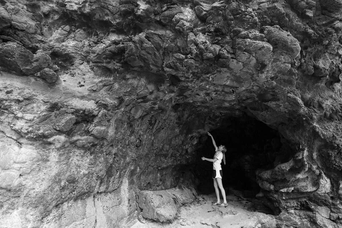
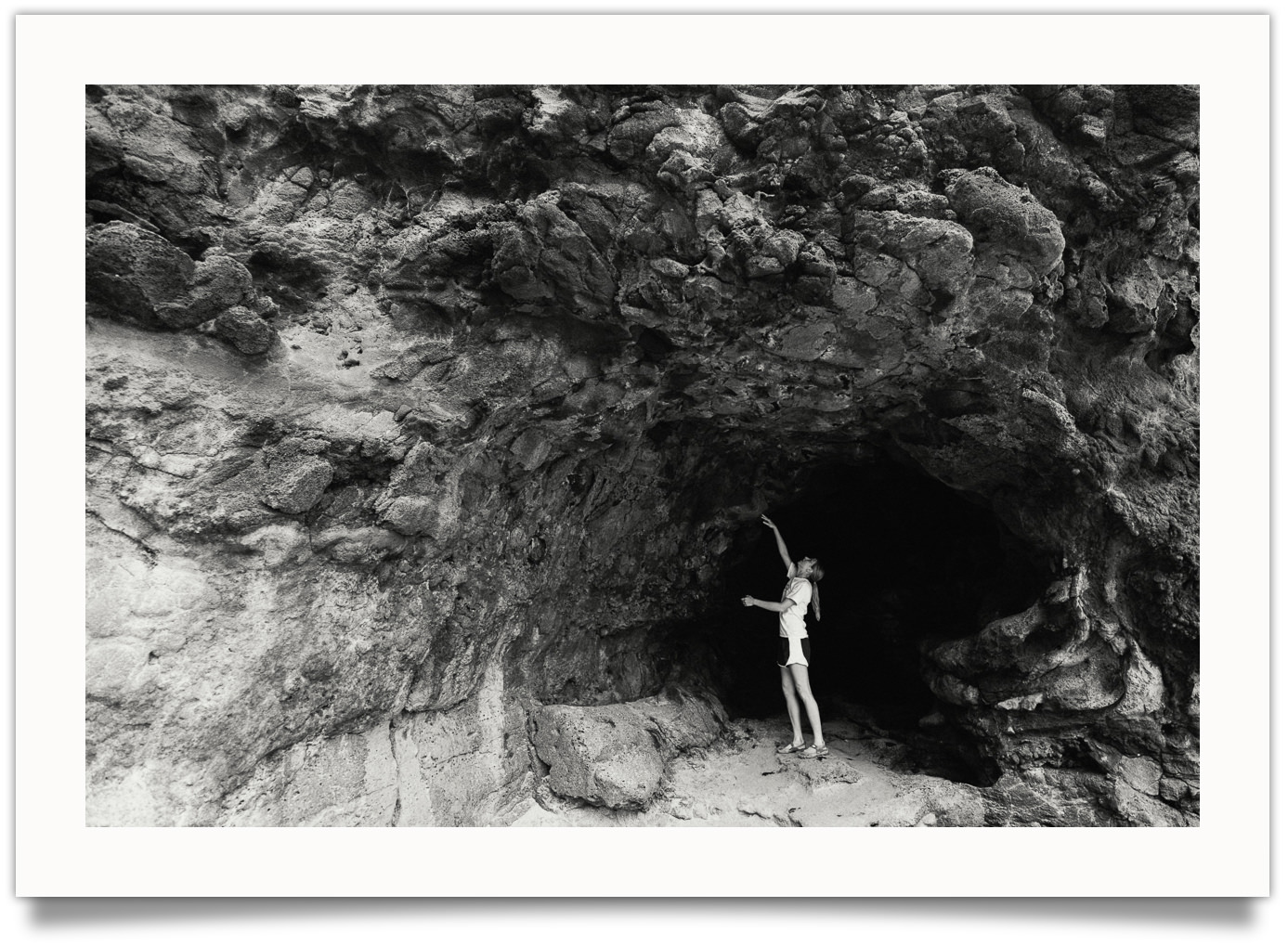
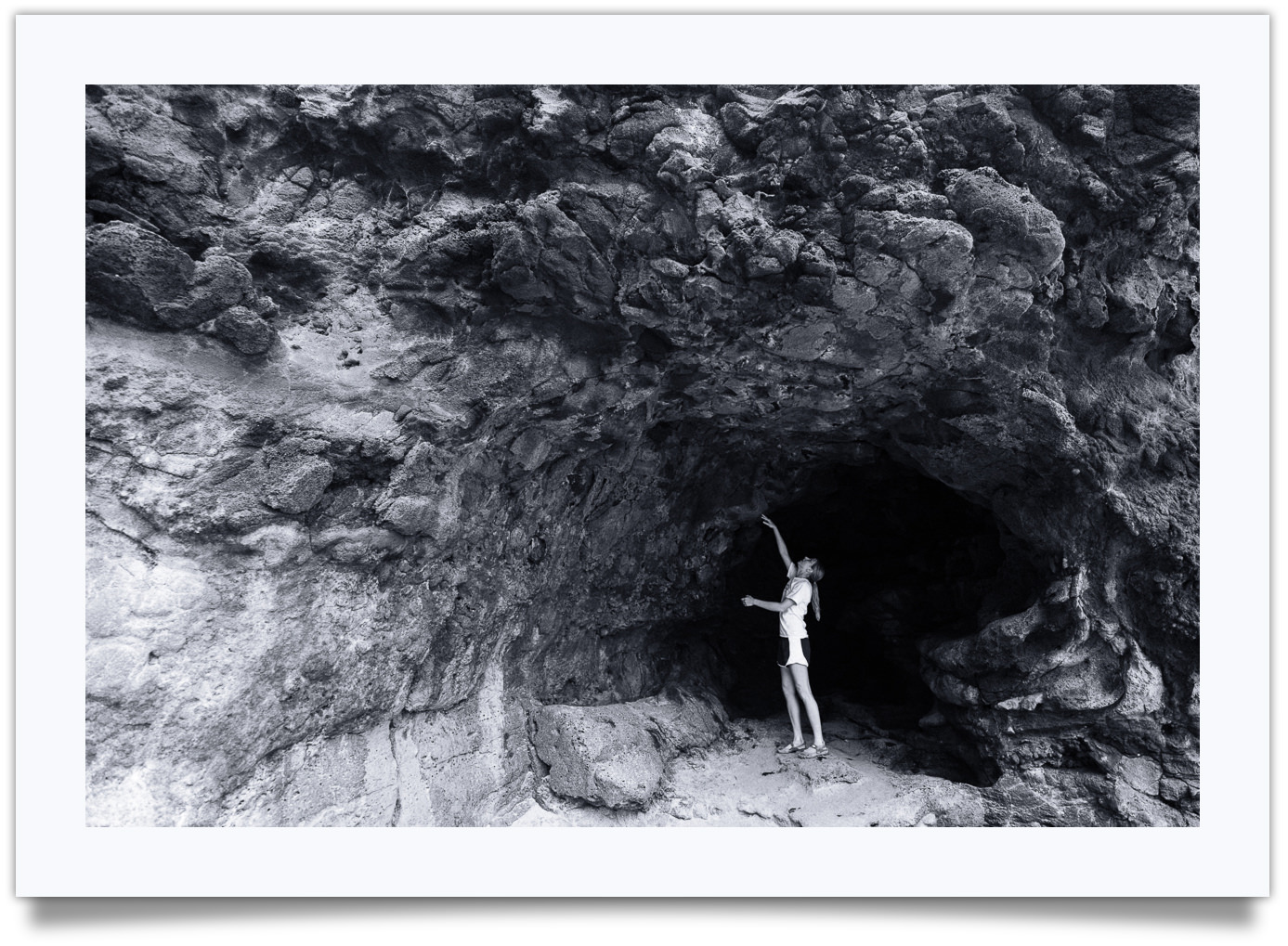
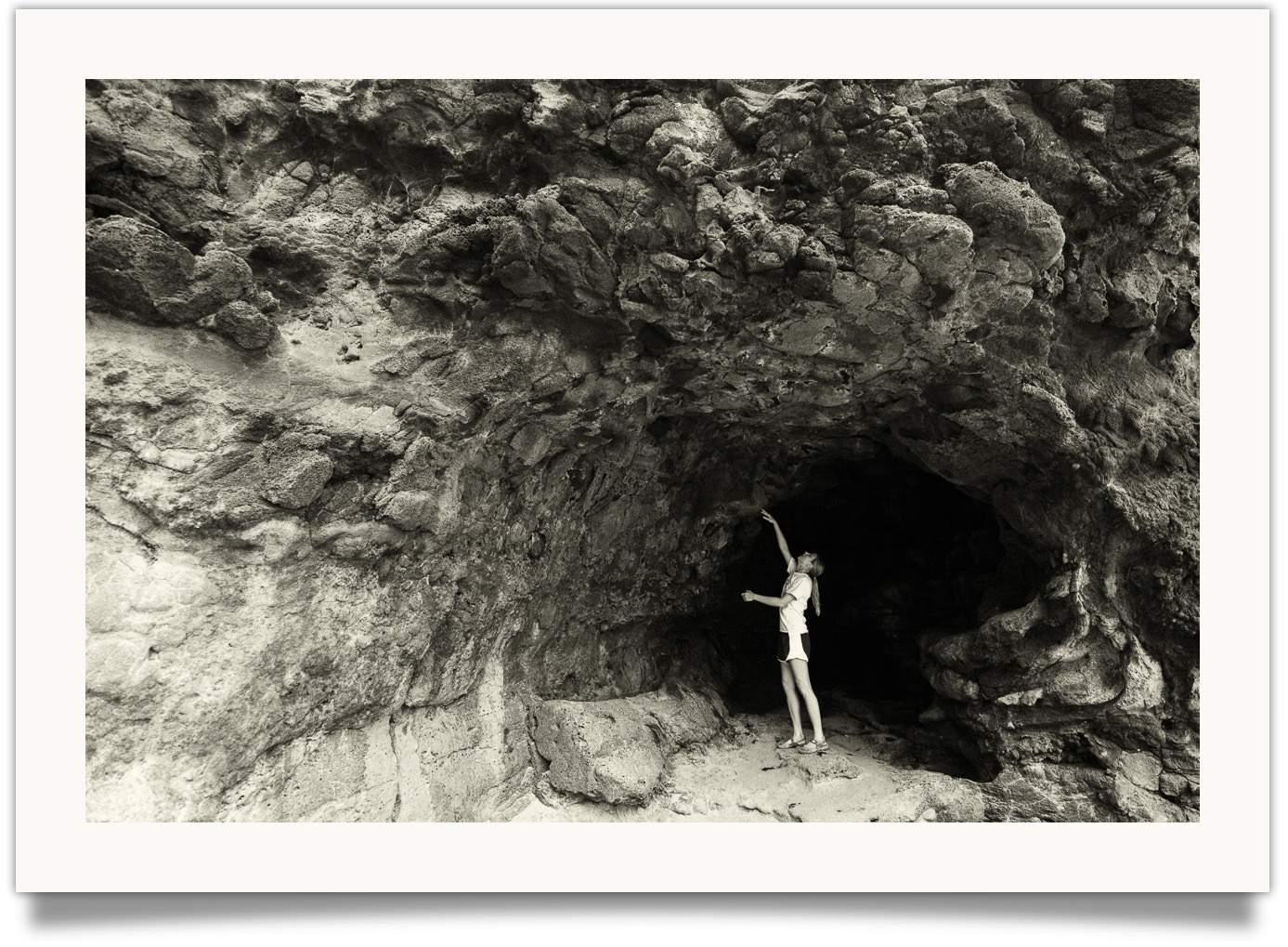
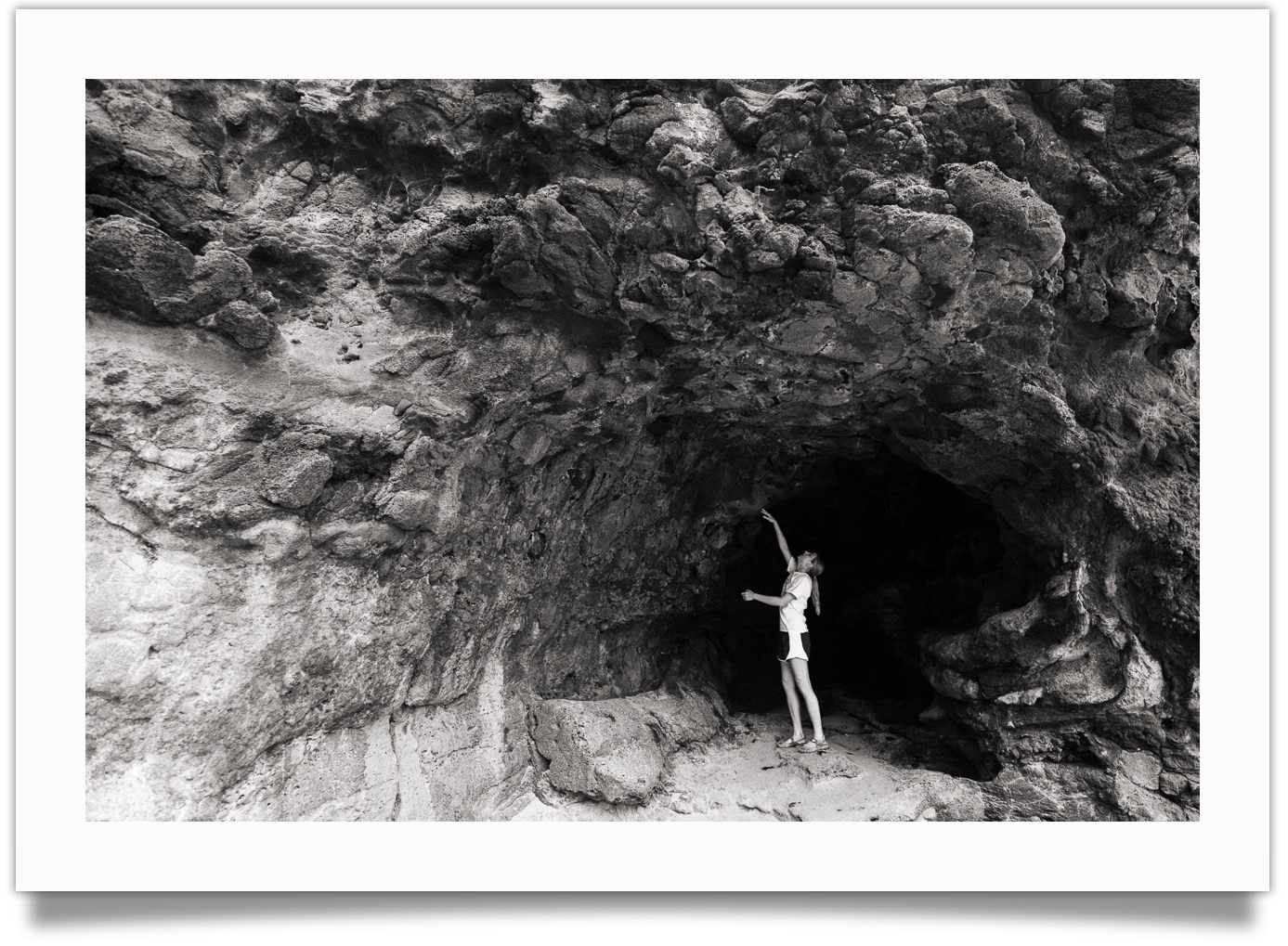
Look closely at the shadows entering the cave. See how Rodinal balances out the tones ever so slightly?
Notes:
- A legendary classic developer, invented in 1891. (Currently available under the names Foma Fomadon, Adox Adonal and Compard R09)
- Produces smooth, even tones (great for high contrast scenes)
- High acutance, bringing out subtle details in shadows and highlights
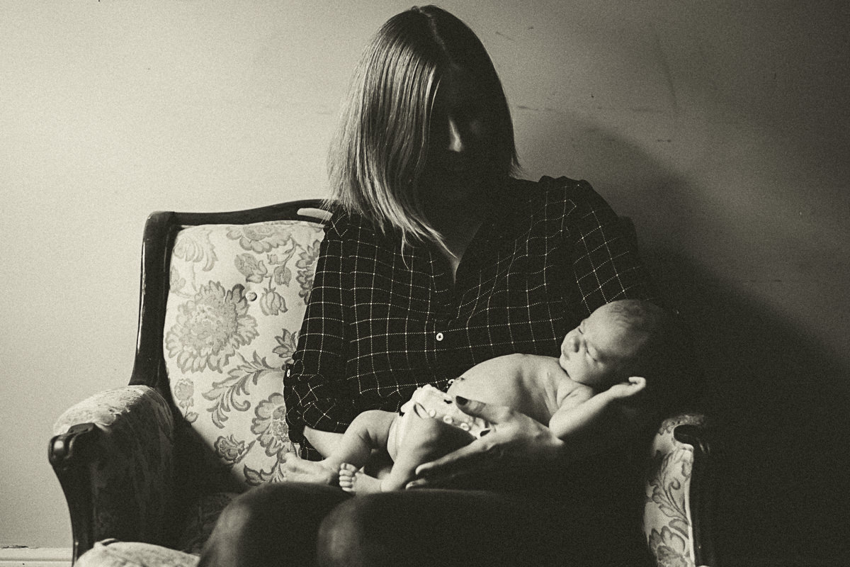
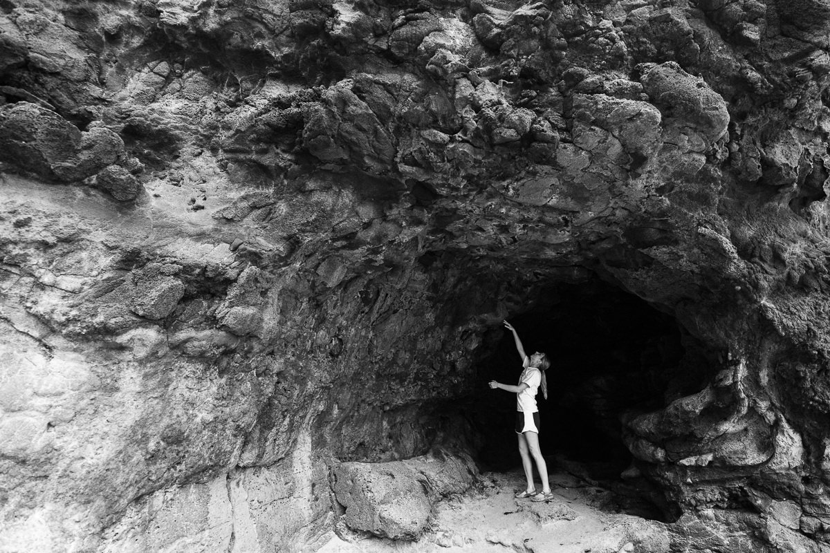
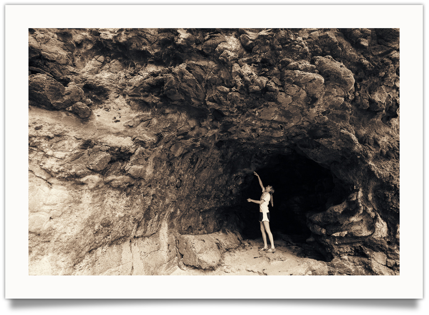
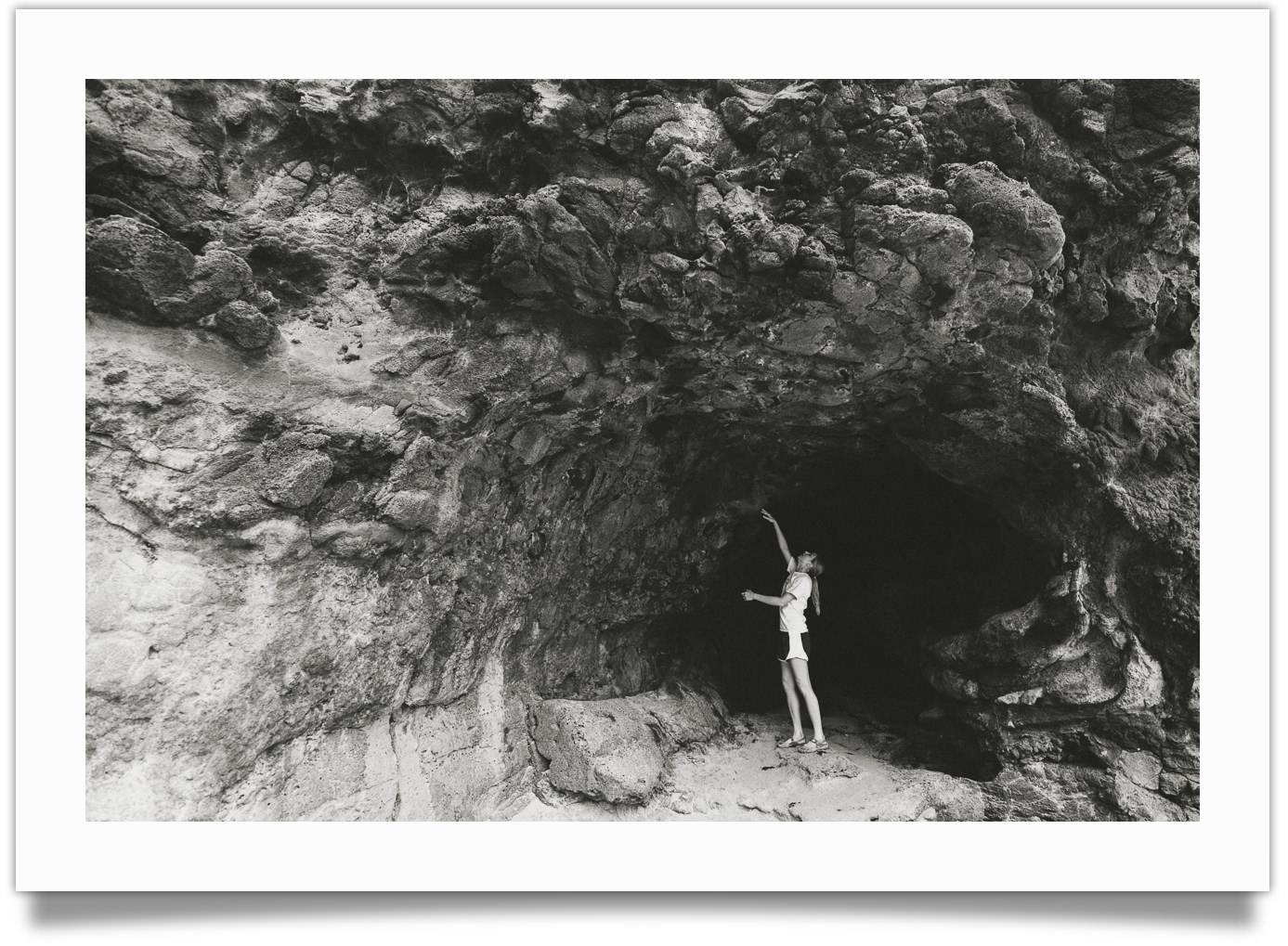
Kodak HC-110
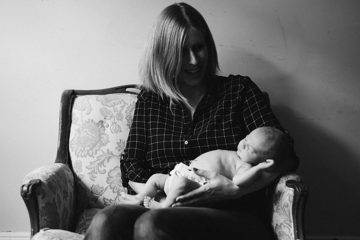
Best for: Deep dramatic tones (think Ansel Adams).
HC110 deepens the shadows, making the photo more dramatic, and causing the central figure to appear brighter in contrast to the shadows.
Notes:
- Ansel Adam’s preferred developer
- Deep, bold black tones add lots of drama
- More room for contrast in the highlights
- Has a “glowing” quality to it, with less perceived clarity
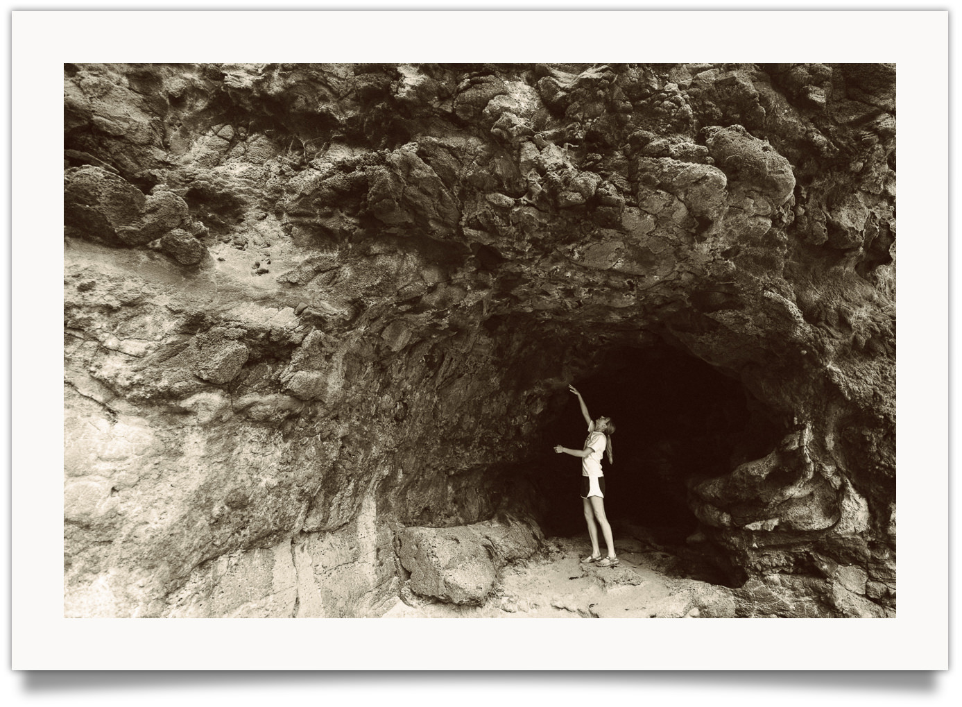
Kodak XTOL
Best for: Clean, modern tones
XTOL adds a touch of clean contrast. To emphasize brighter tones, you can also try the XTOL – Bright presets.
Notes:
- The most “modern” of the developers in this pack (invented in 1995)
- Good balance of mid-tone contrast and detail sharpness
- Tends to produce brighter, cleaner photos
If you love the way your photo looks with just the film preset, you don’t have to use a developer preset. The regular film presets provide an average interpretation of the developers. Sometimes, that may be just what you want.
03. The Papers
One of the most fun aspects of X-Chrome is the paper & toner library. This is an area with a lot of potential to be creative and change the look of your photo.
Papers & toners were a key part of the “look” of the black and white masters – like Ansel Adams and Paul Strand. In fact, they were as important a consideration as anything else in their workflow.
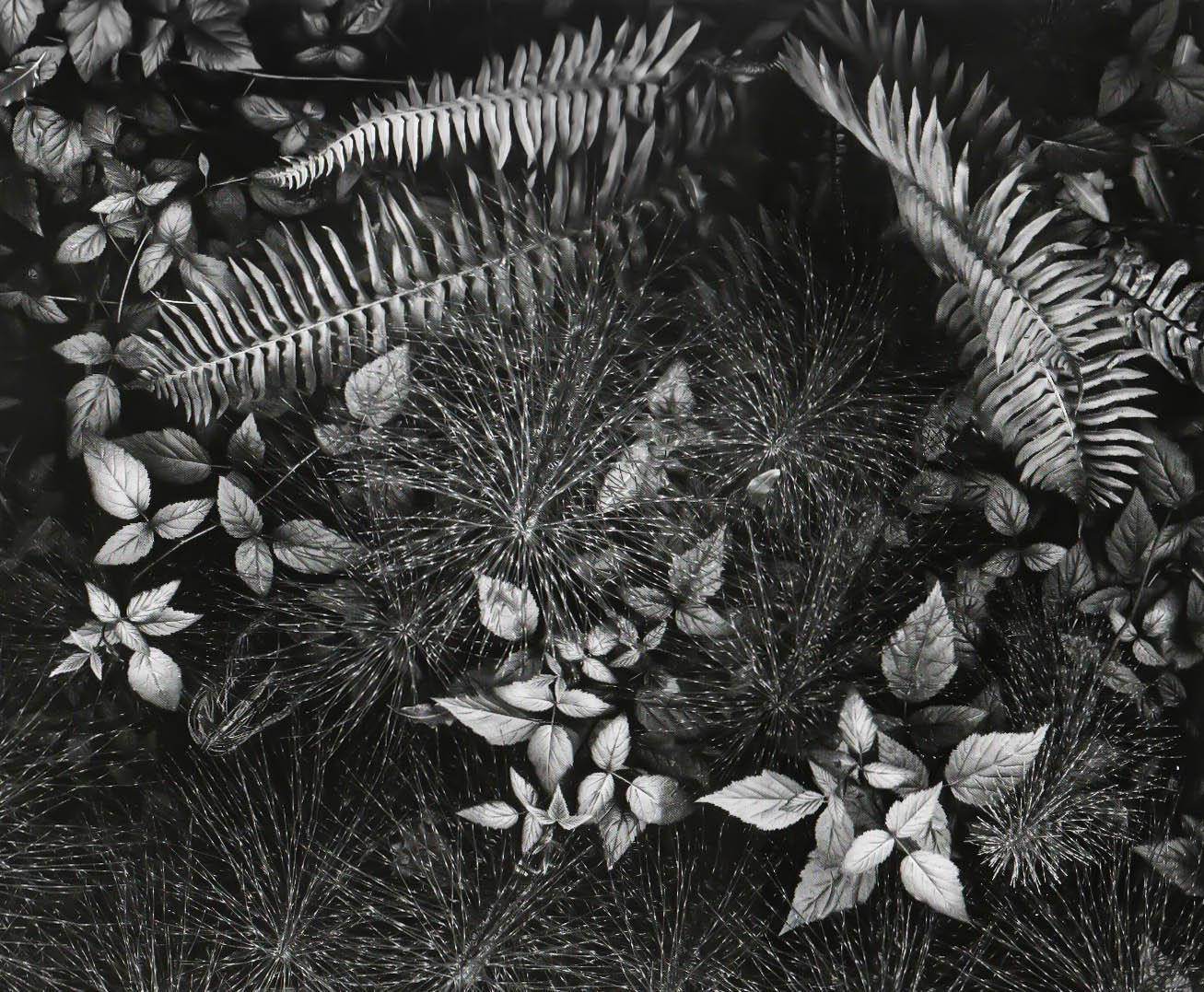
Leaves by Ansel Adams. This photo isn’t truly monochrome… Adams used a selenium toner here, which gives warm tones to the highlights. Because we perceive warm colors as closer, this gives the photos a “3D” quality. The darkest shadows here also aren’t rendered as “pure black”, but have a slight matte.
This gets lost in digital, were in many cases, the photos we take will never be physically printed. But with the papers and toners presets in X-Chrome, you can recapture that finished print look.
There are two considerations when in comes to paper selection…
1. TONING
Many of the best “black and white” photos are not truly just black and white. There are subtle color tints that have been added during the darkroom process.
This can happen one of two ways: you can use a paper which already has some tone to it (like Ilford Warmtone, Ilford Cooltone, Fomatone, etc), or you can add a chemical toner during the development process (like Selenium, Copper, Iron, etc).
There’s a wide variety of hues and intensities that can be achieved with toning.
2. FINISH
In the digital world, it’s easy to think of “white” as 100% brightness, and black as 0% brightness. But in the physical world of paper, it isn’t that easy.
But most “white” paper is not truly 100% white… in fact, there’s a direct correlation between the brightness of a paper, and it’s longevity. The cotton and other fibers used to make paper is naturally off-white. To make paper brighter, you have to add chemicals to the paper, which reduce the longevity of it. That’s why “museum” or “archive quality” paper is not very bright.
Likewise, most paper does not render “black” as 0% bright. Even the darkest papers are still reflecting a little bit of light. This is especially true for various “matte” papers. In fact, today we associate the faded blacks of “matte” finishes as being “premium and classy.”
Ok, so let’s get on to the papers…
Fine Art – Museum Cotton – Natural
Slight warm toning // subdued brightness w/slight matte finish
Included Variations:
Fine Art – Museum Cotton – White → no toning
Fine Art – Photo Rag Satin – Natural
Slight warm toning // slight fade and rich tonal blacks
Included Variations:
Fine Art – Photo Rag Satin- White → no toning
Ilford Cooltone Paper
Cool blue toning
Included Variations:
Ilford Cooltone [-] → 50% strength
Ilford Cooltone [matte] → matte version
Ilford Warmtone Paper
Warm toning
Included Variations:
Ilford Warmtone [-] → 50% strength
Ilford Warmtone [matte] → matte version
Neutral

No toning
Included Variations:
Neutral Glossy → deeper black tones
Neutral Matte → matte version
Neutral Matte + → strong matte version
ScanTone
Very subtle tone warming – similar to natural tone of scanned in film negative
Copper & Iron
Intense toning with cyan shadows and copper highlights
Included Variations:
Copper & Iron [-] → 50% Strength
Copper & Iron Matte → matte version
Fomatone
Intense golden toning (Fomatone [-] shown above)
Included Variations:
Fomatone [-] → 50% strength
Fomatone – matte → matte version
Fomatone – matte [-] → 50% strength matte version
Kodak Brown Toner
Antique brown toning with slight matte finish
Included Variations:
Kodak Brown Toner [-] → 50% strength
Selenium #1
Warm yellow highlights and cool blue shadows, with rich blacks and bright whites.
Included Variations:
Selenium #1 [-] → 50% strength
Selenium #2
Yellow-green toning with slide matte finish
Included Variations:
Selenium #2 [-] → 50% strength
Selenium #3
Yellow green toning with strong matte finish
Included Variations:
Selenium #3 [-] → 50% strength
04. The Black and White Toolkit
The Black and White Toolkit in X-Chrome includes a number of fun and useful tools. You will probably won’t need to use these tools on every photo, but they can be incredibly valuable when used in the right situations…
Color Convertors
While X-Chrome is primarily a black and white pack, I’ve found that it can also give me incredible color results. Editing in black and white makes it SO much easier to see and adjust tone. Once you have that tone looking good in black and white, chances are it will also look great in color.
- Portra-fy → converts your photo back to color with soft, pastel colors. Reminiscent of Kodak Portra.
- Kodachromify → converts your photo back to color with deep, bold colors with red undertones. Reminiscent of Kodak Kodachrome.
- Fujify → converts your photo back to color with green and yellow undertones. Reminiscent of Fuji 400H.
I’ve also found that these look amazing when combined with tinted papers. Check out the X11-X15 premixes for examples.
Lens Filters
Analog film shooters could manipulate how brightly different colors were rendered in black and white by using a colored filter over their lens during shooting. The filter would let in light that was the same color as the filter, while blocking the light from other colors. So, for instance, a Red Filter let’s in red light, but blocks lots of blue light.
This can be emulated in Lightroom using the “Black and White Mix” settings.
- Red 25a – This is the strongest of the color contrast filters. It dramatically darkens blue skies. Useful for landscape and architectural photography. Not recommended for portraits.
- Orange YA3 – Slightly less strong than the Red filter. Still not recommend for portraits.
- Yellow K2 – A lot of black and white photographer through this on their camera and left it there. A good way to add just a touch of contrast to most scenes.
- “Color Contrast” – This is my own addition and doesn’t really have an analog counterpart. This filter darkens all colors (but doesn’t impact unsaturated tones). This can add some really cool, modern contrast.
B+W Fade // 0-10
The Black and White Fade settings give you the ability to precisely control the amount of fade in your image. It’s built to work with the way I’ve used the different settings in X-Chrome.
NOTE: This will over-ride any paper settings you have. That’s because both this and the paper settings rely on the R/G/B tone curves. I use this rather than the split-toning tool because it gives me much more control over emulations. But it does mean that you can’t combine this with toning.
Grain Size
Depending on your camera’s resolution (and your appetite for grain), you can use this to adjust the size of the grain up and down, without impacting the amount and roughness of the grain.
05. Using with JPEG
You will get the best experience using X-CHROME with RAW files. That’s because X-CHROME includes my new custom calibration profiles, which I’m calling “PureTone” calibrations. These profiles use a linear interpretation of your camera’s sensor data – which helps us get better, purer results inside of Lightroom. (Think of it as cooking something from scratch, instead of trying to rescue a meal that’s already half-baked).
If you do have JPEGs you want to use X-Chrome with, you will find a special folder inside X-Chrome for JPEG presets.
This one folder contains both FILM preset and DEVELOPER presets for JPEG. It’s important that you use both from this folder!
Once you’ve selected your Film and Developer from the JPEG folder, you can use the regular PAPER and TOOLKIT folders to complete your image.
Questions & Answers
Have thoughts or questions? Just ask me in the comment section below!
Looking to buy X-Chrome? You can do that on the X-Chrome Sales Page →
Hi,
sorry for the message here but I found no contact page or email address here. I want to buy the package but PayPal will not work. I login correctly in Paypal but he always ask to pay with kreditcard over PayPal not my existing credit on this account. Please check. Thanks.
Kind regards Frank from Germany (sorry for english)
Hi Frank, I know exactly what you’re talking about. For some reason, the service that I’m using to handle my storefront (gumroad) doesn’t accept payment from PayPal credit. Really sorry for the inconvenience… I’m actually testing out a different payment solution that does accept PayPal credit, and doesn’t charge VAT tax… if you’re interested in using that instead, email me at nate@natephotographic.com
Cheers!
-Nate
Hi Nathan,
have see Your answer today and send You a message.
Kind regards Frank.
I bougt X-Chrome yesterday. The Presets have not been installed at the right Place on my Mac (perhaps because I use a new “Ircat” for every Year) . I found the Place to where they belong: Develop Presets in Lightroom-Einstellungen (sorry- thats the German Name). But I do not know, to where the NatePurteTone Camera Profiles shold be shiftet. I also miss a Guide for this feature.
Please let me know this. (Sorry- my English-Lessons have been 50 Jears ago.)
Hi Günter – your english is great (better than my german!). The mac installer should place the presets (and the camera profiles) in the default locations for Lightroom. There are a couple of reasons that this may not work, for instance if you have “Store presets with this catalog” selected inside the settings for Lightroom → Preferences → Presets, the installer will not work. You can manually add all the files.
Here’s a quick video that shows you how to manually install X-Chrome on mac: https://nate-photographic.wistia.com/medias/dn98468o9s
The PureTone profiles are typically placed in “{username}/Library/Application Support/Adobe/CameraRaw/CameraProfiles”. If you used the installer, you may find that they are already there.
Please let me know if this helps!
Cheers,
-Nate
Absolutely love X-Chrome. I can’t believe I waited this long. It’s so fun like being in the darkroom but without waisting all that paper experimenting.
Hi Nathan,
looks really interesting.
I would like to ask you if the presets are working with the same behaviour with Fuji xTrans RAF files.
Thanks and best regards, Helmut
Yes! This works great with RAF files (I mainly shoot with a Fuji X-T2 at the moment). Cheers!
-Nate
Hi Nate,
thank you for your quick reply!
Best regards, Helmut
using it in LR and it is beautiful, the results are very organic and I can only appreciate the passion and effort that went into this.
Wonderful! So glad to hear that, Jeet!
-Nate
Hello Nate,
i bought your X-Chrome presets a few month ago.
A few days ago Adobe rolls out a update for LR Classic CC.
Adobe converts all presets to XMP standard.
In lightroom classic the X-Chrome – 1. Film is working.
But when i want use any X-Chrome developer or X-Chrome paper, the image is in color again.
UPDATE: All has been fixed in LR Classic 7.5 and later, and X-Chrome 1.4 and later.
Hi Nate
Just purchased your X-Chrome presets today. Still finding my feet but it’s been fun.
I’ve just rolled my Lightroom installation back to 7.2.
Noticed that if I apply the B+W Film Fade after using the Fomatone toner preset I lose the golden glow altogether. Is this working as intended?
Thanks!
UPDATE: All has been fixed in LR Classic 7.5 and later, and X-Chrome 1.4 and later.
Hi Nate. I installed X-Chrome today and noticed that “X-CHROME – 0.Premixed” is not showing up in Lightroom although its correctly installed (used the auto-installer and manual). When importing via Lightroom there is an error message saying that the preset file is the wrong type of preset (Lightroom Classic CC 7.3.1). Do you know how to avoid this issue? Thanks in advance!
+1 – is there a solution for this? Thank you in advance.
Hello. I had a similar issue. I’m not sure if my “solution” is correct or not, but at least I can use the presets this way.
If you look at the basic develop panel on your right, you’ll be able to choose your camera profile. It should say something like “Profile: Adobe Color” or something like that. If you click on it and choose browse, you should be able to find “X-CHROME Premixes”, where the premixed presets are. So instead of applying a preset, you apply a profile.
I moved the pre-mixes over to the “enhanced profiles” section on the right hand side (for Lightroom Classic), but it looks like this has just caused confusion. Working on some updates now, and will be moving this back over to the regular presets section.
-Nate
Hello Nate,
I have the same “problem”, 0.Premixed, JPG and JPG – Premixed is not showing up.
Do you already have an update?
Hi! I’ve just issued an update (v1.4) that should fix this (and a number of other LR issues) for users of LR Classic 7.5 and later. If you still have your original email receipt (from “gumroad”), then the link their will take you to the latest download. Otherwise, I will be sending out an email in the next few hours with update details!
-Nate
Hi Nate,
I just purchased, downloaded and seamlessly installed the presets. I am just getting the hang of them and am very impressed with the possibilities. A huge shout out to you for this set of tools. Thank you@
Wonderful to hear, thanks Stephen!
Hi Nate, I’m very excited about your products for digital and film shooters. I shoot mainly medium format film and Fuji digital and it looks like you’ve got it all covered. Can I use another editor besides Adobe? I don’t like LR for Fuji and am wondering if Alien Skin Exposure will work with your products?
BTW, I was born and raised in Philadelphia and still have lots of relatives in the area. Best of luck with all that you are doing!
Dan Morris
Hi Nate,
I like X-Chrome very much.
If it is possible to approach the Ricoh GR3 High-Contrast BW film preset using non Ricoh Raw Files? (Fuji X)
I am using Tri-X @6400 and Kodak HC 110 + and the Ilford Warmtone Paper.
Then I darken the blacks a little. But it works not 100%.
Thanks,
Andreas