Welcome to VSCO FILM 01 – The Missing Guide. This guide is for any digital photographer who wants to get that natural film “look” but hasn’t had all that much experience working directly with film.
I’m a big fan of the film emulators VSCO makes for lightroom, and I’ve seen lots of other posts about VSCO Film 01. But I’ve always want more information about the films themselves.
Sure, you could click through all the presets in VSCO Film 01 and just see what I think “looks good,” but I think a much better approach is to really understand the underlying films which are being emulated. By knowing each films strengths (and weaknesses), you can know exactly what to look for in a film and exactly when to use a particular film over another.
If you spent 20 years shooting film professionally, you probably don’t need this guide, since you will already be intimately familiar with the films of VSCO Film 01. But for the newest generation of photographers, like myself, who appreciate the aesthetic qualities of real film but haven’t spent any time with a film camera or in a dark room, film feels like a whole new world. What’s the difference between Kodak and Fuji? When should I use one class of film instead of another? Does film speed matter when we’re talking about digital shots? How should I process the film to make it look authentic without going overboard?
That’s why I made this “Missing Guide” to VSCO Film 01.
We are really going deep to learn about the actual films in this pack. I’ll show you how the film manufacturers themselves describe their film, when and how to use the film, and my own before & after examples. So let’s jump in!
VSCO Film 01 – The Modern Films
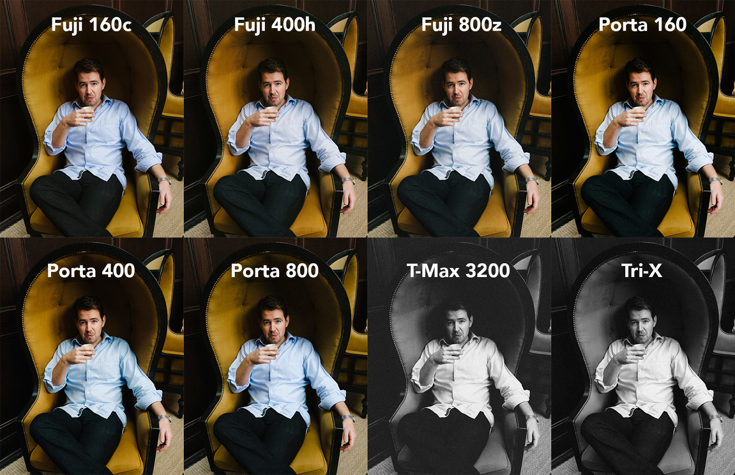
VSCO FILM 01 comparison – The modern films being emulated in this pack are known for their accuracy, so don’t expect wild, instagram-like transformations. At first glance, many of this films look similar, but there are important, subtle differences in how to best use each of them.
VSCO Film 01 is described as “Modern Films.” What does that mean? Well, all the films in this pack are still being produced (or have only just recently been discontinued) and are used widely today by photographers still shooting with film.
From an aesthetic perspective, most of these films will have very natural color reproductions and extra-fine film grain. The films are calibrated to make skin-tones look even & natural, while giving scenes just enough contrast and luminosity. If you want wild color swings, or an extreme “vintage-look,” this isn’t the film pack for you!
VSCO FILM 01 – Great for Weddings, Portraits & More
The films in this VSCO film pack are really targeted at portrait photographers & wedding photographers (although there are additional uses). Almost all the films in the pack are known for their accurate skin-tone reproduction and fine grain structure. If you are a landscape photographer, fashion photographer, documentary photographer, or commercial photographer, there are other films (and film packs) that you should consider instead, which we’ll get into in future posts.
Here’s what’s inside VSCO Film 01 :
For each of these films, VSCO has offers a few presets that vary the intensity of the film effect. In most cases they offer a (-) and (+) and a (++). We’ll cover how and when to use these variations in future posts, but for now, we will just focus on the standard variety, which is the variety that they calibrated to be closest to what you would expect with actual film.
[Sidenote: These are also essentially the same films offered by Mastin Labs. I’ll do a review of Mastin Lab’s Lightroom presets another time]
Fuji Pro Color Films inside VSCO Film 01
The Fuji Pro color films are known for their accurate & pleasing skin tone reproduction. The white balance is neutral, although like all Fuji film, it tends to be just a touch “cooler” than the Kodak pro film, with more blue and green tones.
The most famous and widely used of these films (and the primary one Fuji is still making) is the Fuji 400h film. And at least to my eyes, the 400h seems to be just the right balance of color & contrast. It really brings out beautiful light & texture without looking over processed. But there are great uses for each film.
Fuji 160c
Overview: Fuji 160C film creates “bright” and “clean” images. There’s just a bit of extra fine film grain, and it really pushes the mid & high tones. It also has excellent skin tone reproduction – although in some cases I find that it washes out some details in the face. The colors also feel slightly desaturated verse the other films in this family. All combined, Fuji 160c gives images a nice “pop” and a simple, clean feel.
Best for: Fuji 160C is great for for architecture & portrait photography.
Be Careful of: The contrast added with Fuji 160C will make the gradations in skin tone appear a bit harsh and uneven if you don’t have very soft lighting.
Example Image: The soft, even lighting in this image is ideal for Fuji 160c film. After applying the film preset, the skin takes on a porcelain quality, while the eyes, lips & hair benefit for the extra contrast. I could have used the 400h, but it may have felt a little dull in this scenario.
NOTE: Just use the slider on the image to see what the image looked like before and after applying the VSCO preset. In all of these examples, the only thing that has been changed in each image is the application of the VSCO preset.
More Resources for Fuji 160c film:
- Fuji’s datasheet on 160c film.
- Fuji 160c was recently discontinued by Fuji, you can still see the product page and customer reviews of the film on B&H.
- Check out what people are doing with this film at Flickr’s Fuji Pro 160S/C Photo Group
Fuji 400H
Overview: Legendary skin tone reproduction, with silky smooth gradations from the highlights to the shadows. Just enough film grain, contrast, and saturation to give images a 3-dimensional quality without looking overdone.
Best for: Wedding photography and fashion photography.
Be careful of: Honestly, it’s hard to go wrong with this film as long as you’re using it for portraits, weddings or fashion photography. There’s a reason this film is still in so much demand with photographers around the world.
Example Image: I positioned the lighting in this image to try to convey a feeling of depth and richness, but straight out of the camera, it still felt flat and uninteresting. The Fuji 400h preset instantly added depth and character to the image. The skin tone is just perfect, and the gradations of colors in the shadow on the chair are so much richer and more interesting now. This is quickly becoming my go-to film & preset for portraits.
More resources for Fuji 400h film:
- Fuji’s Datasheet on 400h film.
- The film is still available for purchase on B&H.
- Find some inspiration at Flickr’s Fuji Pro 400h Group
- “Why I shoot Film as a Wedding Photographer” with some beautiful examples of Fuji Pro 400H
- A great comparison of Fuji 400h and Kodak Portra 400 at varying exposures.
- More great examples of using Fuji 400h by photographer Lisa O’Dwyer
Fuji 800z
Overview: Fuji 800z film is able to bring out natural, true-to-life skin tones in difficult situations, like low-light, flight-light, or mixed light. The film grain is much more noticeable than with the 160C or 400H, but in the right situations it can add a pleasant depth and texture to the image. It also seems to me to be a little less saturated in the highlights and shadows, which is what makes it capable of evening out skin tones in difficult scenarios.
Best For: Low-light or mixed light situations where accurate skin tones are important. It’s a great “rescue” film preset for documentary-type images where you don’t have control over light-sources.
Be careful of: You will lose some saturation and add some graininess with this film, so just be sure that is the look you are trying to achieve. (Given that this is digital, by the way, you can also cheat and just edit the lightroom settings after you apply the preset. )
Example Image: I took this image with very low, very flat light. You can see in the original that there are major differences in skin tone across the face because of the lighting conditions, in some places looking too green and in others too magenta. The Fuji 800z film does a beautiful job of cleaning this up. The skin looks much more natural and even, and the whole face just “pops” so much better of the background now.
More resources for Fuji 800z:
- Here’s Fuji’s Datasheet on 800Z.
- Fuji has also recently discontinued this film, but you can still see the product page and reviews here.
- Flickr’s page for Fuji Pro 800z
- Examples of Fuji Pro 800z by photographer Doug Kim
- RB Design talks about why they love using Fuji 800z
Kodak Pro Color Films inside VSCO Film 01
Kodak Pro film is known for it’s warm, vibrant tones. The Kodak film really makes skin tones look glowing and luminous. To my eyes, it looks a little less true-to-life than the Fuji Pro film, but this may be the look you are trying to achieve.
Like the Fuji, in most situations I would recommend starting with the 400 variety. The Kodak Portra 400 is the most balanced and versatile of the bunch, and is often compared to the Fuji 400h.
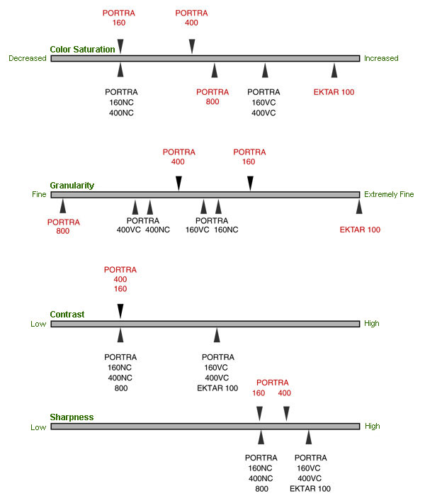
To see how Kodak’s Pro color films compare, Kodak has made us this handy chart. There’s even a few extra films in there that we’ll see in future film packs.
Kodak Portra 160
Overview: Like the rest of the Kodak Pro films, Kodak Portra 160 has very neutral tones which tend towards the warmer side of the spectrum. The 160 is has the least saturated colors of the Kodak Pro films, and the film grain is extremely fine. The skin tones from the Portra 160 are light and luminous – almost glowing.
Best for: Portrait photography, fashion photography, commercial photography.
Be careful of: If you are looking for saturated colors, this is not your film. Also, if you’re not careful, this film can wash out details in your subject’s face.
Example photo: You can really see the impact on skin tones and saturation in this image. Without any retouch work, the skin is incredibly even and luminous. The tone of the blue hat shifts more towards teal, and the purple loses much of its vividness.
More Resources for Kodak Portra 160:
- Here’s Kodak’s documentation on Portra 160.
- Kodak Portra 160 on Flickr
- Kodak Portra 160 Product Purchase & Reviews at B&H
- Great images and review of Kodak Portra 160 by Twin Lens Life
- Great audio review of the film by Figital Revolution
Kodak Portra 400
Overview: PORTRA 400 film hits the sweet spot of saturation, sharpness and contrast, with just a hint of film grain for added depth. Colors are vivid, skin is glowing. The saturation is enough to make this a viable film for travel & outdoor photography (though there are other films which are more generally more ideal for this).
It gets compared a lot to Fuji 400h. To my eyes, the Portra 400 has a little less texture and depth to it than the Fuji 400h. The Portra feels shiny and perfect, whereas the Fuji feels more raw, organic and lived-in. So the Portra seems more suited to commercial & product photography, while the Fuji 400h is more ideal for wedding photography. But the difference are subtle.
Best for: Portrait, fashion photography, wedding photography & commercial photography.
Be careful of: This is a great, versatile film and can be used in many situations.
Example photo: The Portra 400 film preset here really makes the photo feel full of life and light. The skin tone feels more natural to me than the Portra 160, and the saturation levels are perfect.
More resource for Kodak Portra 400:
- Kodak’s documentation on Portra 400.
- Portra 400 product overview and reviews on B&H
- Kodak Portra 400 group on Flickr
- Great video on using Kodak Portra 400
- Gorgeous examples of using Portra 400 film by Matthew Osborne
Kodak Portra 800
Overview: The Kodak Portra 800 has the same great skin tones, but with added saturation and more noticeable film grain. It does a great job of really making the skin look great in even very difficult lighting situations. Out of the Kodak Pro color films, this one adds the most character and vibe with added film grain.
Best for: Low light, natural portrait photography. Great skin tones with a bit of extra vibe.
Be careful of: This adds a good amount of film grain, so if you are going for a clean, refine look, this isn’t your film.
Example photo: The Portra 800 really improves the skin tone, adding some much needed luminosity to it. The film-grain also gives it more of a raw feel.
More resources on Kodak Portra 800:
- Kodak’s own tech pub on the Portra 800
- Kodak Portra 800 on B&H photo
- Kodak Portra 800 Flickr Group
- Great video on using Portra 800 in low light, indoor conditions to bring out grain
Modern Black & White Film inside VSCO Film 01
In VSCO Film 01, VSCO also gives us three difference black & white films. Let’s go over each one briefly.
Ilford HP5
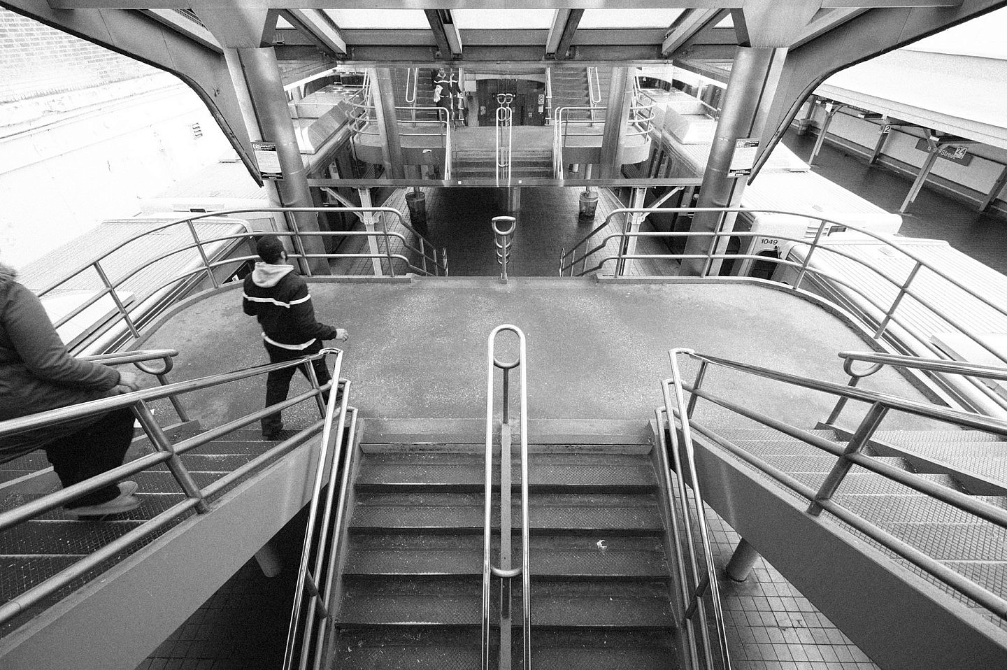
Ilford HP5, along with Kodak Tri-X, is one of the gold standards of modern black & white film. It has a medium contrast & slight grain. It’s rated at ISO 400, but photographers can push or pull the film during development to get a rating of ISO 200 to ISO 1600. Later VSCO packs give you the option to push or pull certain films, and we’ll look at exactly what that means in future posts.
It’s a good choice for general purpose photography, street photography and black & white portrait photography.
More resource on Ilford HP5:
Kodak Tri-X
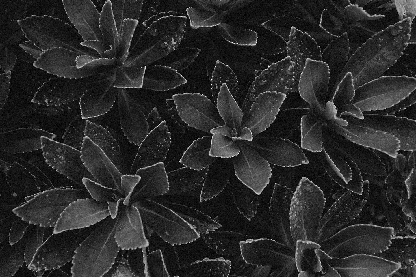
Kodak Tri-X is the world’s best-selling black-and-white film. It is very similar to Ilford HP5, with fine grain, medium contrast and high sharpness. Also much like Ilford HP5, it’s common practice to manipulate the film during development to increase contrast levels dial up the grain.
It’s a very usable and practical black & white that works in a lot of situations. Between this and Ilford HP5, it’s really hard to discern much of a difference.
More resources for Kodak Tri-X:
- Kodak Tri-X Flickr Page
- Kodak’s own tech pub on Kodak Tri-X Film
- The Tri-X Factor – Why Great Photographers Love Kodak Tri-X
- What I Learned Shooting 100 Rolls of Tri-X
Kodak T-MAX 3200
Kodak T-MAX originally came in 3 film speeds: ISO 100, ISO 400 & ISO 3200. The 3200 is actually a multi-speed film that in reality, is rated at ISO 800 and can be pushed up to ISO 3200 in development. Because of it’s incredible speed, it was used a lot in surveillance work and even in X-ray cameras. But it was discontinued by Kodak in 2012 due to limited demand.
So what we have here in VSCO FILM 01 is a simulated effect of pushing Kodak T-MAX all the way to ISO 3200. This gives photographers more of a raw, rough, vintage look. There is very noticeable levels of film grain, and the loss of details in the shadows that you would expect from pushing it to such high ISO levels.
This film adds a lot of texture & character to photos, making it particularly well suited to city shots and street photography.

More Resources for Kodak T-MAX 3200:
- Kodak T-Max 3200 Group on Flickr
- Kodak’s Tech Pub on the T-Max 3200
- More history on the T-Max 3200, which was really revolutionary when it came out in the 80’s
Conclusions on VSCO FILM 01
As you can see, there are a lot of exciting films in VSCO Film 01. Now that you have a better understanding of each of them, I’d recommend you go back to your photos, and just experiment with the presets. Before you apply a filter, though, just pause and try to visualize what it will do to your photo. Will it increase saturation or decrease saturation? Will it warm your photos up, or cool them down?
With a little practice, you’ll become familiar enough with each film in the VSCO FILM 01 library to know exactly how & when to use it. You may even start to think about which film you will be using as you are in the process of shooting. Knowing how a particular film will react to the conditions of the environment will help you discover new possibilities and take your photography skills to the next level.




Thanks for all the guides you post on here! I’ve been shooting for a while now, almost exclusively digitally. After hearing all the popularity over VSCO film presets, I bought the first pack and gave it a try. However, most of the time I used them I felt clueless and all over the place, as if I were slapping on filters on Instagram. The history of each film and its effects on saturation and tint really simplified the entire process, and I hope you write more of these guides.
Thanks so much, Bryan! Really appreciate your feedback!
Thanks for doing these guides, man. These help me out a lot.
My pleasure. Glad they are helpful!
Hi, thx for sharing information and I have one question about VSCO film 01.
Today I just bought this one and in black and white option I only have Kodak Tri-x 400 (- + ++) and I wonder if there should be Tri-x and Tri-x 100 (200, 300)?
Thank you for the answer.
Nope, it’s just TRI-X 400 in this pack. You’ve got the right thing. 🙂
Great read dude. Thanks a lot.
Hi,
Are you still doing the VSCO 3-6 missing guides?
Yes! Just got a little behind! My plan is to do in this order: 5, 6, 4 (and maybe 3).
Hi Nate… Are you going to write the missing guides? Thanks!
I know I know! It’s long overdue… I actually have a draft of my guide to VSCO Film 05 almost ready to publish, but I’m slammed right now trying to get X-CHROME out the door…
Thank you so much for writing these VSCO FILM – Missing Guides. Very generous of you. These guides are well done, informative, and useful. Looking forward to you other guides. I am glad that I found this page.
Hi,
This Was Very Informative Thank You. I Started Shooting Late 2015 & I’m Still Looking For My Style, If You Could Please Go Through Film Pack 3,4 And 5 That Will Be Very Helpful.
Hi !
Thanks so much for this ! I’ve been fighting with presets since years now, and the only films I know are Portra since I shoot film too. But this guides are so helpful !
Really hope other guides are going to follow 🙂
Stewart
Thank you so much, exactly what i was looking for. Please continue the series 🙂
Thank you for your time in providing these vsco guides. So incredibly informative and helpful. I see a whole new world now. Greatly appreciated.
Thank you
-alvin from the Philippines
Very useful Guide thank you so much 😉
Nate hay, how do I get Lightroom presets vsco 01 films – the modern movie ??
Please reply
You need to purchase them from VSCO
Very useful! Thank you 🙂 when there will be the explanations for the others packs?
Good morning, Nate. Thank you for your in depth reviews and explanation. You’ve helped me narrow down my choice, but I need help for either keeping or thinning.
Based on yout reviews, I’ve decided to purchase packs 01, 04, 05, and 06. Do you think I’ve made a good choice/selection? Are there any redundancies in my selection in terms of looks/style? Which two packs would you suggest as must haves? I don’t want to experience buyer’s remorse once again :/
Thank you for your time.
Regard,
Mike.
I would start with 1 and 5. Then 2. Then 7.
Thank you for you guide. 🙂 Really helped to choose between all these packs.
Can you tell me a little about your work flow? what LR edits do you make before adding the preset and which do you make after?
Thanks so much for your time.
Hi Nate,
This is a great site, I am really thank full for all the in depth information you have provided on vsco. I am new food photographer, what vsco pack would you recommend for me ? I like taking dark moody images of my food.
Thank you!
Is there a cheat sheet for film pack 01? I only got one for 02 and 07. Thanks so much!
These guides are brilliant. Just exactly what I need!
THANK YOU, THANK YOU, THANK YOU!!
Aww, shucks. Thanks Kim 🙂
Hi Nathan,
Isn’t it true that these VSCO 1 presets were for free before?
I can’t find that free VSCO package anywhere anymore 🙁
Can you help/clarify maybe?
Thanks so much
Lot x
The Netherlands
Hi, at one point, VSCO had a free starter pack (00) which contained Kodak Gold (from pack 05) and Tri-X (from pack 06). It appears that they stopped offering that unfortunately.
wow this is so extremely helpful. I’m a young shooter so don’t know much about film. thanks for taking the time to create such a detailed guide!!!
Thanks so much Nate, for your guides and cheat sheets – this is just what I was looking for today ! Cheers. Pete
P5 Preset
Super guide(s) and exactly what I was looking for. I grew up shooting film but have forgotten most of the particular characteristics. I’m just a serious amateur looking to have some fun. A professional wedding photographer friend of mine was using 01 pack to wonderful effect. However, I’m thinking that since I like to take either landscapes or punchier snapshots of people/family, the 04 slide pack might be better suited to my needs. Any thoughts?
Love your consistent descriptions of each film followed by before/after demo and discussion. Very nicely done!
Amazing Guide, thank you so much..
So helpful. Thanks so much!!!
so useful, this is the best guide I found on the whole net. Please make Film Pack 5 guide!!
please provide the missing guides for the other VSCO films. Great guides!
Hello Nate, thank you very much for your guide. I really appreciate it!
Hello, man. I’m wondering if you are going to make another review about VSCO packs. It would be nice you to make another one about pack 05. I enjoyed the 3 ones you already made, by the way. Nice job.
Great Post!!!!!!!!