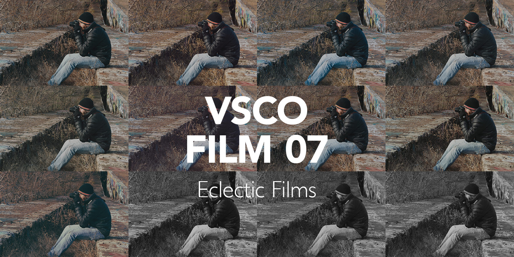
VSCO Film 07 – the “eclectic films” – is VSCO’s most diverse film pack to date. My goal in this guide is to help you deeply understand the films inside this pack so that you can intuitively know when and how to use each film to its fullest potential.
So let’s jump in!
VSCO Film 07: Overview

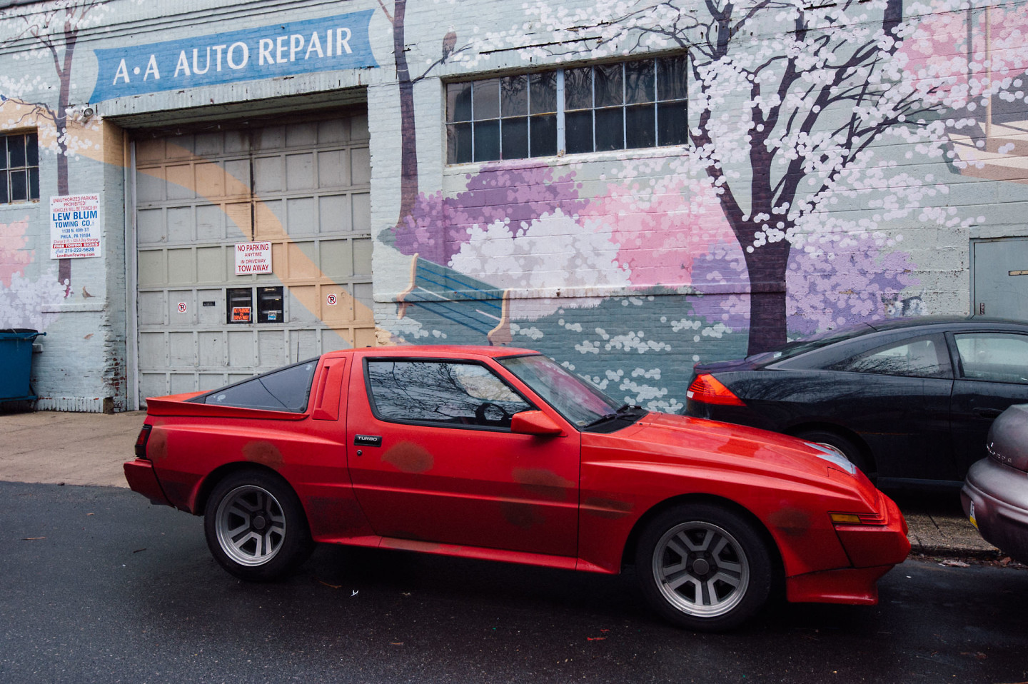
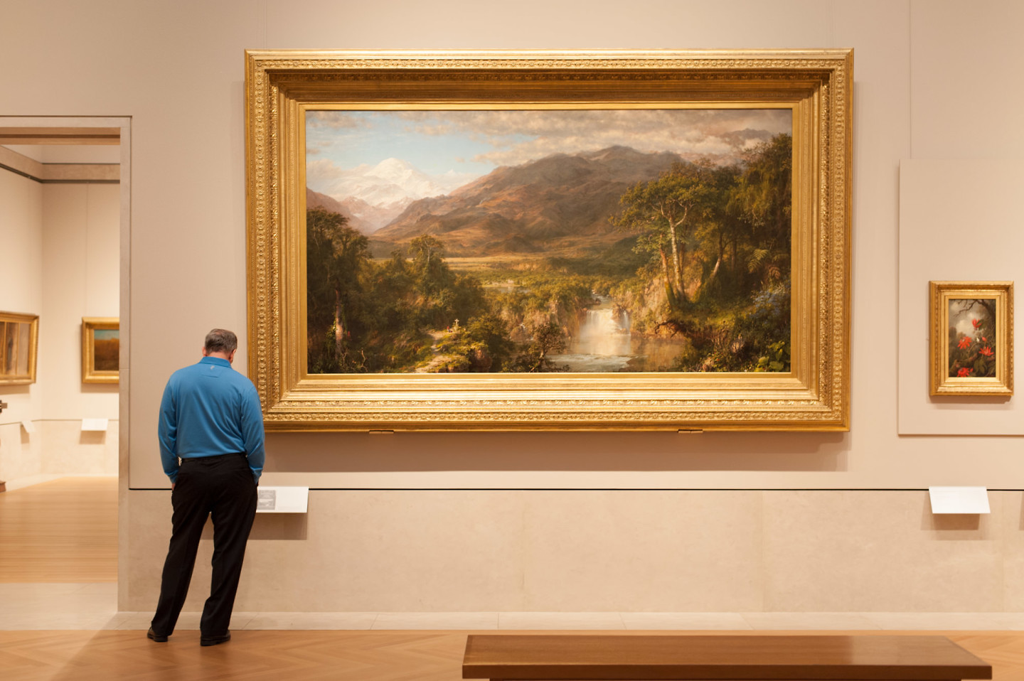
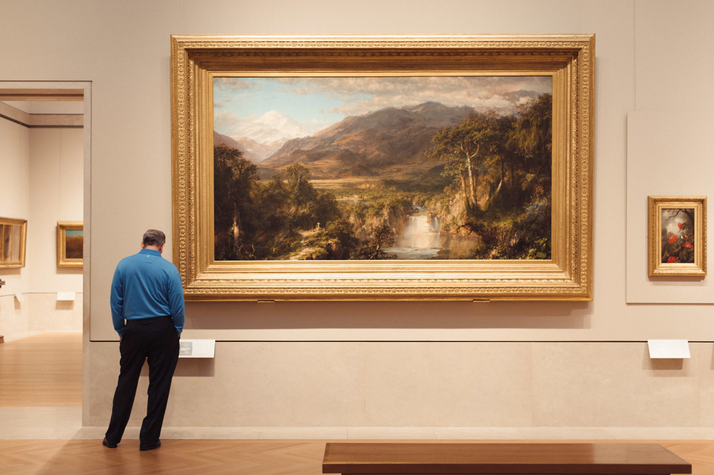
VSCO Film 07 has a large diversity of film-types, earning its “eclectic” name. The above image was processed with Kodak Elite 50 – a consumer slide film with a cool color palette, but warm highlights.
There are some really great films in this pack, and once you know how it use them, it will really help you get just the right “look” for photos and speed up your photography workflow.
There are also a LOT of films to review in VSCO Film 07, with 18 main films and 125 variants. We’re going to see old films & new films, negative films & slide films, professional films & consumer film, daylight-balanced films & tungsten-balanced film.
So brace yourself! This is going to be a long post!
VSCO Film 07: Defining Characteristics

The films of VSCO Film 07 generally produce subtle effects, with low film grain. This example is Kodak Ektachrome 64, which was a favorite of professional photographers and used often by National Geographic.
Despite having many different types and eras of analog film, the films in this pack generally show the following 3 characteristics:
- Subtle Effects – almost every film in this pack produces relatively subtle effects. In general, you should not expect the kinds of dramatic effects or wild color swings you would find in, say, VSCO Film 03 or VSCO Film 04.
- Very Fine Film Grain – All of the filmshave low ISO speeds (between ISO 25 and ISO 320). This means there’s not a lot of grain, and not a lot of fading. If you are trying to product super-moody, super-grainy city shots, this is not your pack!
- General Purpose – While there are a few exceptions, most of the films are intended for “general use.” This simply means they weren’t specifically made for one purpose, like portrait photography, or landscape photography.
The Films of VSCO Film 07
Ok, enough talk about the pack, let’s look at the films!
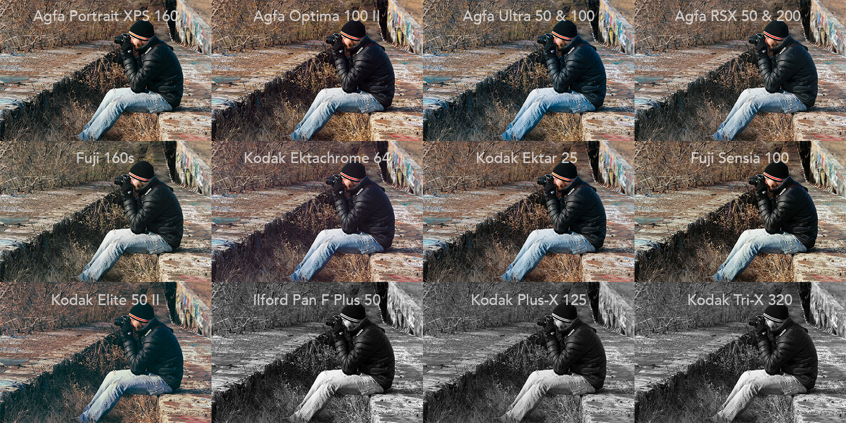
Here are the daylight-balanced films in this pack:
These daylight-balanced films can be broken down into 4 categories:
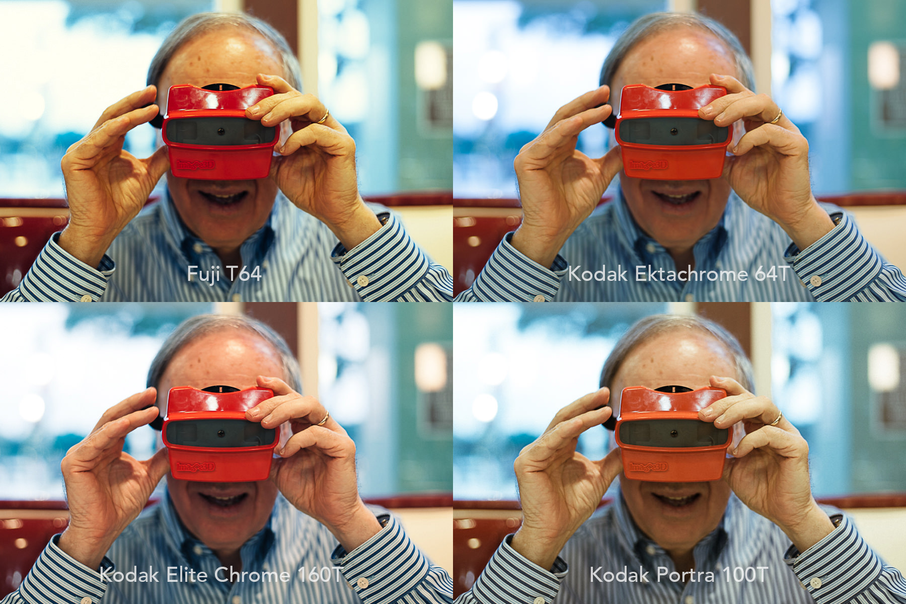
And here are the tungsten-balanced films:
Agfa Triade Film System
In the early 1990’s, Agfa released three professional negative films, which collectively they called the “Triade” film system. The idea was that this would give photographers three different levels of saturation that would be ideally suited to three different purposes:
- Agfa Portrait 160 – the least saturated of the bunch, with soft colors and pastel tones that really make skin tones look fantastic.
- Agfa Optima 120 – natural color saturation levels, with just a touch of contrast. It’s a versatile film that works well in most situations.
- Agfa Ultra 50 – high color saturation, especially for a professional color negative film.
You’ll quickly see that Agfa has it’s own distinct look (much like Kodak and Fuji have their own look). Agfa generally produces accurate to slightly warm images, with red undertones. It’s less recognizable than Kodak or Fuji, but it produces really pleasing images.
Agfa Portrait XPS 160
Saturation: Muted
Contrast: Low
Color Balance: Very warm, pastel-like colors. Smooth skin tones.
Film Type: Professional Negative
Overview: This is one of my all-time favorite portrait films. It produces soft, dreamy, smooth skin tones. The contrast is quite low, so if you are shooting a scene that is already low range, it may make your images feel flat and dull. But for outdoor portrait and other high range portrait situations, this film really shines. It also produces really pleasing, pastel-like greens and blues that compliment skin tones nicely.
Best for: Outdoor portraits, Weddings.
Examples:
I love what the Agfa Portrait does to the skin tones in this shot. It removes some of the blue / purple cast and gives the skin a glowing, dreamy quality. I also love what it does to the green in the background.
Additional resources on Agfa Portrait XPS 160
- Photo-utopia looks back at Agfa Portrait XPS
- Reviews for Agfa Portrait XPS 160 at photographyreview.com
- Role of Expired Agfa Portrait 160 on Flickr
- More great photos using Agfa Portrait 160 by Magnus Joensson. Look at the description of each photo in his stream to see which film he is using.
Agfa Optima 100 II
Saturation: Medium
Contrast: Medium
Color Balance: Accurate colors, adds slight warmth, wonderful reds
Film Type: Professional Negative
Overview: Agfa Optima 100 has wonderful color reproduction, with warm, deep red tones. It has medium levels of saturation and contrast, which will work well in a lot of different situations. It also has great color depth, with life-like colors in shadows.
Best For: When VSCO talks about “General Purpose Film” this is what they mean. It won’t dramatically change your digital images, but it will give it just a little bit of extra life and dimension.
Examples:
I love the sense of depth this preset adds on cloudy days. It also makes the red tones in this image pop, while still maintaining distinct tones.
This preset also imparts a beautiful warm-saturated tone to daylight images. And even though the added contrast in this preset intensifies the shadows, there is still lovely color and detail in the shadows.
Additional resources on Agfa Optima 100 II:
Agfa Ultra 50 & 100
Saturation: Medium-High
Contrast: Medium
Color Balance: Accurate colors. Stronger blues & greens than Agfa Optima.
Film Type: Professional Negative
Overview: On paper, Agfa Ultra is supposed to be the ultra-saturated film of the Triade. In these presets, though, I find the differences between this and Agfa Optima are subtle. Blues and greens are in fact noticeably more saturated, and the color palette is a little cooler. But the saturation levels aren’t as over the top as I had expected based on descriptions.
Best for: Another good general purpose film. Better than Optima when you want saturated blues & greens.
Examples:
Notice the added vividness & lushness to the greens in this image.
This film also brings out vivid blue tones.
Additional resources on Agfa Ultra 50:
- Agfa Ultra group on Flickr
- An ode to Agfa Ultra by Steve Huff Photo
- I miss you Agfa Ultra by Matthew Saville
Other Professional Films
We talked a little about the difference between professional and consumer films in our VSCO Film 02 guide, but I’ll talk a bit more about it here.
One of the biggest difference with professional film is that more care was put into ensuring neutral color balance. What does that mean? Well, analog film’s color balance changes over time, so manufactures would “age” the professional film and ship it right when it’s color balance was ideal. Retailers would then immediately refrigerate the professional film to keep it in balance.
For the purpose of VSCO Film 07, this means that these professional films have a higher chance of having the originally intended neutral color balance, assuming VSCO could get their hands on film stock that had been properly preserved. Even with these precautions, it’s likely the film’s colors have shifted a bit. But it’s way closer than they are likely to get with consumer films.
Beyond color balance and handling, Professional films typically favor more natural color saturation and contrast. But this varies by film.
Agfa RSX 50 & 200 II
Saturation: Medium
Contrast: Medium
Color Balance: Neutral with clean yellows & muted greens
Film Type: Professional Slide Film
Overview: While all of the original literature on this film considers it to be “high saturation,” I don’t find that to be the case with this preset. It could just be that it was considered high saturation before technological advances, or it could be that VSCO was working with expired film. Whatever the case, this preset gives a very subtle effect with a slight retro Technicolor quality. Greens are noticeably washed out and tinting towards yellow. This film also really brings out the details in shadows and highlights, giving it an archival quality.
Best for: General purpose. Portraits are detailed & textured, while landscapes feel dry & arid.
Examples:
While the overall effect is subtle, notice how much detail is maintained in the shadows and highlights despite the overall increase in contrast. Also notice how the films tones down the green in the bottom left.
Here’s another example of what I mean that Agfa RSX mutes the greens, but gives a really great range of yellows.
Additional resources on Agfa RSX 50 II:
- Here’s an old advertisement for Agfa RSX from 1996
- Agfa RSX review on photographyreview.com
- Agfa RSX description with examples on lomography.com
- Agfa RSX photo pool on flickr
Fuji 160S
Saturation: Low
Contrast: Low
Color Balance: Slightly cool with a green tint.
Film Type: Professional Negative
Overview: This is a lower contrast, lower saturation version of Fuji 160C, which we saw in our VSCO Film 01 review. In fact, the “C” in 160C stands for “contrast,” while the “S” in 160S stands for “sharp.” With that in mind, Fuji 160S has many of the same qualities we saw in 160C – like creamy skin tones, neutral gray balance and fine grain structure. This version has slightly more natural skin tones, with less vibrancy and “pop.”
Best for: This is a really lovely portrait film when you want to add a clean, cool vibe. Personally, I find that using the “++” version of this in VSCO gives me results closer to what I’d expect.
Examples:
This is the “++” version of 160S. Look at how desaturated the blue shirt becomes. Also notice the overall green tint that’s added (similar to other Fuji films).
Again, using the “++” version because I find this feels a little truer to the examples of actual 160s film that I’ve seen. The green tint gives portraits a really nice vibe.
Additional resources on Fuji 160S:
- Fuji 160s Datasheet from Fuji
- Beautiful examples of using Fuji 160S by Matt Day.
- Model shoot using Fuji 160s and Kodak Portra 400.
- Fuji 160S overview and reviews on Adorama
- Fuji Pro 160S photos on Flickr
Kodak Ektachrome 64
Saturation: Medium
Contrast: Medium
Color Balance: Neutral Colors
Film Type: Professional Slide Film
Overview: Kodak Ektachrome was a staple among professional photographers for decades. It has a distinctive look with rich, natural colors and soft highlight contrast, making it a favorite among National Geographic photographers. It’s color palette is cooler and contrast less intense than it’s famous sibling, Kodachrome. But it was simpler to process and could shoot at higher speeds than Kodachrome.
Best for: Great all-around film, though it was particularly popular with fashion, documentary and landscape photographers. For portraits, this film will produce very detailed, beautifully textured skin (in comparison to portrait films which tend to make skin “glow”).
Examples:
This film produces gorgeous natural colors and rich texture.
The “+” version of this film adds some really pleasant red tones. Great details and colors. Note how this preset brings out the natural texture in the skin. This works well for documentary-style portraits, but it doesn’t produce the “glowing” skin typically sought by wedding photographers.
Additional resources on Kodak Ektachrome 64:
- What’s the difference between Ektachrome and Kodachrome – from Kodak’s FAQ
- Kodak Ektachrome technical data from Kodak
- An extensive history on Kodak Ektachrome
Kodak Ektar 25
Saturation: Medium
Contrast: Medium
Color Balance: Neutral colors, slightly warm palette
Film-Type: Semi-Professional Negative Film
Overview: Kodak Ektar 25 was a semi-professional negative film originally produced in 1989. The Ektar line was later discontinued and rebranded under the “Royal Gold” name in the mid 1990s. It was known for having incredible colors & clarity, as well as virtually no film grain. This film produces slightly brighter colors, with deeper blacks and greater “pop” than Ektachrome. It also produces more “glowing” skin tones.
In practice, all of this means that images it produces won’t be all the far off from the images you see straight out of camera RAW. Think of it as more of a subtle enhancement to digital images than as creating a strong “film” look, unless you start veering towards the “+” variations of this preset, which represent expired versions of this film.
Best for: A very usable general purpose film. This film emulator is the most likely in the bunch to simply look like a well-processed digital image.
Examples:
Even using the “warm” variant of the preset above, the colors don’t vary wildly from camera RAW. Deepening the shadows also gives images a bit more “pop.”
Once again, this preset makes minor but meaningful changes to the image. It deepens the shadows and adds warmth to skin tones. But colors are spot on. It’s hard to go wrong with this film.
Additional resources on Kodak Ektar 25:
- Great Real World Comparison of Ektar 25 and Ektar 100
- Kodak Royal Gold 25 technical data (as noted in the PDF, this has the same technical characteristics as Kodak Ektar 25)
- Flickr group for Kodak Ektar 25
Consumer Films
Consumer films are more likely to be expired and off balance from a color perspective. Why? Simply because manufacturers and retailers didn’t put the same care into them. Retailers shipped them early (before they were ideally balanced) with the assumption that it would take a few months before they were sold and used by consumer enthusiasts.
There was also a tendency in consumer films to add a bit more contrast, which added “pop” but meant loss of detail in shadows and highlights.
Not surprisingly, we see both of these traits in the consumer films inside VSCO Film 07.
Fuji Sensia 100
Saturation: Medium
Contrast: Medium-Strong
Color Balance: Strong yellow-green tint. Overall washed-out colors and very muted blues.
Film-Type: Consumer Slide Film
Overview: Fuji Sensia is a consumer slide film that was discontinued in 2010. You’ll notice right away how much more unnatural and unpredictable the colors are in the film vs. the professional slide films we just looked at. This particular preset shows a strong green and yellow tint, with washed out colors and virtually nonexistent blues. Some of that may be inherent to Fuji Sensia, but some of it may just be due to basing this preset on a batch of expired film.
To help represent some of the unpredictably of this film, VSCO has a (+) and (++) version of this film to show tints found in expired versions of the film. The (alt) version looks like it is attempting to recreate a non-expired, neutrally-balanced version of the original film.
Best for: This film evokes a pretty dismal feeling, so you can use this wherever you want to emphasize that feeling. For me, that’s in urban cityscape photography.
Examples:
The strong green-tint & washed-out colors make this photo appear even more grim.
The one color that does seem to do really well in Sensia 100 is green. It produced a deep, lush green that really stand out beside the generally muted colors.
Additional resources on Fuji Sensia 100:
- Fuji Sensia on B&H Photo
- Fuji Sensia 100 Datasheet from Fuji
- Fuji Sensia group on Flickr
Kodak Elite 50 II
Saturation: Medium
Contrast: Medium
Color Balance: Cool color palette with pastel tones, noticeable warm shift in highlights
Film-Type: Consumer Slide Film
Overview: Kodak Elite 50 II is a really interesting consumer slide film. Overall, the color palette is cool with pastel tone. This is balanced though with warm tones in the highlights. It has medium contrast with deep blacks, similar to Fuji Sensia, but I find the colors more interesting and usable.
Best for: Personally, I like this for City and Documentary photography. It adds a really classic, slightly expired slide-film look to photos.
Examples:
The cool color palette with the warm highlights creates a really interesting, balanced look.
The warm highlights with cool shadows can produce interesting results in skin tones.
Additional resources on Kodak Elite 50 II
Black & White Films
VSCO Film 07 gives us three more options for black & white films.
Ilford Pan F Plus 50
Overview: Ilford Pan F Plus 50 is a high-contrast black and white film with rich blacks and great skin tones. Despite being high contrast, it does a great job of maintaining details in highlights and shadows. This film is a popular choice among black & white analog film shooters, and is still available for purchase.
Examples:
The high-contrast of Ilford Pan-F Plus 50 gives this image a striking “pop,” but doesn’t blow out the details in the highlights.
Additional resources on Ilford Pan F Plus 50:
- Pan F Plus Technical Information from Ilford
- Reviews and Info from B&H photo (this film is still available)
- Ilford Pan F Plus for Landscape Photography
Kodak Plus-X 125
Overview: Kodak Plus-X 125 is an even film with soft open shadows and soft highlights. It has noticeably less contrast than Ilford Pan-F Plus, but as a result, has smoother mid-tones.
Examples:
Kodak Plus-X produces a much subtler effect than Iflord Pan-F. Notice how much softer and open the skin tones appear here. The trade-off though is less overall “pop” to the image.
Additional resources on Kodak Plus-X 125:
- Kodak Plus-X 125 Technical Data from Kodak
Kodak Tri-X 320
Overview: Kodak Tri-X 320 is somewhere in-between the previous two examples, with moderate levels of contrast and brilliant highlights. According to Kodak, this is more ideal for studio lighting.
Examples:
Kodak Tri-X 320 adds a medium amount of contrast, and pushes the highlights. In this example, at least, the skin tones appear somewhat patchy to me.
Additional resources on Kodak Tri-X 320:
- Kodak Tri-X 320 Technical Data from Kodak
Tungsten Films
Tungsten films were designed to accurately represent colors under tungsten light. Tungsten lights have a warm, low color temperature (around 3200 kelvins). The color temperature of daylight is much higher and cooler (around 5500 kelvins).
With RAW digital film, we don’t really need a special film to balance the color temperature. We can simply adjust white-balance in post. So if we shoot under tungsten light, we can simply adjust the white balance to 3200K, and voilà – problem solved! (In fact, even with these Tungsten presets in VSCO Film 07, we still need to manually adjust white-balance to 3200K to get the correct white balance!)
But these Tungsten film presets can still help in another way: by cutting down on the luminance of reds and yellows. Even once your color is balanced to the temperature of tungsten light, the extreme brightness of reds and yellows can impact your image. These tungsten presets help tone this down and create more natural-looking images in tungsten lights.
Fuji T64
Overview: A high contrast tungsten-balanced film. The regular version adds a strong green tint to images. I find the the “+” version of this preset to be much more useful.
Examples:
Using the “+” version of this preset provides neutral colors and cuts down on the luminosity of reds and yellows. This creates a more natural looking image.
Additional resources on Fuji T64:
- Fujichrome T64 Datasheet from Fuji Films
- Fujichrome T64 shot in daylight from Matthew Perrir
Kodak Ektachrome 64T
Overview: A very subtle, low contrast Tungsten film with neutral colors. This is a good choice for room interiors & artwork.
Examples:
This preset has a very subtle effect. It very lightly cuts down on the intensity of yellows and reds.
Kodak Elite Chrome 160T
Overview: A medium contrast tungsten-balanced film with cool tones in shadows.
Examples:
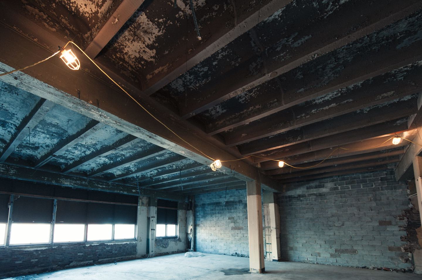
The cool shadow tones in this film help to balance out and accentuate the warm light from the ceiling lanterns.
Additional resources on Elite Chrome 160T:
- Kodak Elite Chrome 160T Technical info from Kodak
Kodak Portra 100T
Overview: Very muted pastel colors with a strong greenish-blue tint. I couldn’t find many examples of the actual film in use, so it’s not clear if this is an accurate representation of the actual film. In my tests, I had awful results trying to use this for tungsten-lit portrait, which according to Kodak is one of the primary purposes of this film.
Examples:
The greenish-blue tint of this film can be useful for effect, but it did not produce the accurate skin tones I was expecting.
Additional resources on Kodak Potra 100T:
FREE DOWNLOAD: VSCO Film 07 Cheat Sheet
Wow, we just went through a lot of films! To help make it easier to use this knowledge in the real-world, I put together a little cheat sheet for you. You can reference it while you process your images!
Just fill in the form, and hit “download.” I’ll send you a link to the download right away!
Also, if you find these guides helpful, I’d love to hear from you in the comments section below! Tell me what you think, what you’re working on and any questions you have!


















Thanks for the time you put into this Nathan. Really well done. Just purchased this pack thanks to your post.
My pleasure, Phillip! And thank you for your kind comment 🙂
I came in for the 10 free NATE cam presets but found these details of VSCO presets very useful! Thanks a lot again for the efforts!
Thank you so much for this! The best source of knowledge about the VSCO films. 🙂
Just downloaded the film pack and, wunderbar, thanks a lot for the guide Nathan!! Now using it to edit my travel pictures, will be waiting for the guide for film 05. Followed your Instagram, and thank you again for being inspiring.
Do You have VSCO film pack 07 free?
No, you need to buy that from VSCO. You can do that here. Definitely worth the price!
This helped me to understand VSCO so much better! Amazing job, really Im really impressed with the quality of your work on writing this.
I’m waiting anxiously for the guides from 03-06!
Thank you very much
Same here! Your site is PURE GOLD Nathan!
Very helpfull review!! its realy helped me to understand 7 th vsco pack. I wanted to ask you about 4th vsco pack, when it will be ready? i really wanna to read about 4th pack. thank you very much
Hi Nathan,
I’d really like to pick up something from VSCO. My camera shooting RAW (an old Leica D-Lux 2) is not listed on the supported cameras at the VSCO site, do you still think it’s worth getting?
Also, I shoot a lot of iPhone stuff too so I wondered if VSCO products are okay processing jpeg files in Adobe Camera Raw?
Any advice would be much appreciated.
Kind Regards
Hi Jason, I think it would still be worth picking up this pack. The “standard” presets in this pack work quite well on RAW. As long as Lightroom itself supports your camera (i.e. offers an “Adobe Standard” camera calibration profile), you should get great results. This is because VSCO uses Adobe Standard as a base for their custom presets.
With JPEGs, on the other hand, you will get unpredictable results. Your camera has already made important decisions about how to convert your image from RAW to JPEG. So the VSCO effects will be applied on top of the effects your camera has already added. I’m sure you can play around with this and still get pleasing effects on JPEG, but don’t expect anywhere near the same results as from RAW. Hope that helps!
-Nate
Great post. Thank you. patrick.
This is Awesome! I’ve been looking for something exactly like this for a log time. Thank you so much for your effort to pull this together. Now I can stop clicking through all my presets looking for the right tone, and wondering why some work differently from scene to scene.
Best Regards,
Dan
Thanks so much this is superb.
Wow, I just spent 3+ hours reading through all your VSCO guides, thank you! This is exactly what I have been seeking and I found it incredibly helpful. I am going to buy the VSCO presets now 🙂 I also have been researching for about a year all the different film stocks and what their intended use was and what characteristics they have/had trying to make sense of all the options and learning so that I can use the presets accurately and true to what the film stocks really looked liked (I have also been shooting film ;-). Any idea when you are going to have Guides 3-6 out??? I know it must be a huge amount of work. I will be excited to read them whenever you get them finished. Thanks again for all your detailed research and clear/concise information. Loved the sliders with the photos too! Incredible! Thank you, thank you, thank you!!!
P.S. Also really curious how you felt the Mastin Lab presets compare to the VSCO Film 01 presets. I actually already have all the Mastin Ones but haven’t found myself using them much…
Wow, great post! Thank you so much for your effort, this was very helpful!
This is a fantastic guide for Film 07. Definitely a lot to remember and you’ve broken it all down very well. Thanks for taking the time to put this together!
Your post a so very helpful. Now I know the purpose of all those presets and I can choose among them in a much more organized way. Before I was just randomly hoovering over the presets to see what they do – I even didnt know what to look for.
Hopefully you can post your comments on the presets of the other packs, too. You were working on it, but dont know how far you got. I believe it is quite some work – BUT SO HELPFULL!
I made myself some “zero”-presets with just your description in the title to have them allways at hand.
Such a nice series of posts. They are so useful! Really looking forward to read about the other filters. Many many thanks!
Just found this from a Reddit comment – these VSCO guides are so useful for someone just starting out. Thank you!
Hey Nate! Thank you for the guide.
I was wondering… all the example pictures were taken on RAW or JPG? Cause i have the packs and sometimes the picture color and style doesn’t look at all like your examples. I usually shoot on raw.
Hey! All the pictures here were taken RAW on Nikon D700. In theory, it should look similar across cameras (because their camera calibrations are based on Adobe Standard, which is standardized across camera models), but in practice, there is difference just because sensors / lenses can be so different. I’m curious what camera you are using?
Great info Nate….Have been struggling sorting through the various VSCO Packs and options. With your help now feel confident enough to the pull the trigger and purchase this film pack – 07. Many thanks for your time and efforts!
Hi Nate,
I keep popping in here to see if I missed the VSCO 03-06 film guides but they seem to be put on hold?
Hi Noel – sorry it’s taking so long… these guides take a considerable amount of time and effort to create and recently I’ve been more focused on creating my own NATE Cam preset packs, as well as a course that shows you how to build your own presets in Lightroom… I don’t get any compensation from VSCO (or anyone else) for making these guides, so they have kind of fallen off my radar. If there’s enough interest in continuing, though, I’ve been thinking about setting up an account on http://www.patreon.com to keep making these guides for photographers who really want them. The next guide I have planned in VSCO Film 05.
Hey Nate – I just found you site and I LOVE IT! Thank you for all your effort! I would be happy to support you and your work so yes please create a patreon account 🙂
These guides have been amazingly informative. I can’t wait to put them to use (currently reading them on vacation). I was just confused on one point- Is it necessary to convert my RAW image to greyscale before applying a B&W preset?
Hello Nathan,
Amazing work, very valuable and much appreciated… Thanks!
So far, I bought film sets 1, 2 and 4 and I’m pretty happy with them, though I’m very VERY interested by the Kodak Ektachrome 64 in film set 07 (National Geographic sounds pro and the film seems perfect for travel photography…).
Are the Kodak E100G and E100VS (pack 4) Ektachrome, ou E-something-else? Will the Ektachrome look very different from these Kodaks in film set 4?
In other words, is Ektachrome64 worth investing in film set 7 if I have film set 1, 2 and 4?
Your expert opinion would be much appreciated again ^^
Kind regards,
Adrien
Hi Adrien!
Thanks so much for your kind words 🙂
Yes, E100G and E100VS from pack 4 are different varieties of Ektachrome (and definitely more commonly used than Ektachrome 64). You will find that Ektachrome 64 is considerably more subtle than E100G or E100VS (both in real life and in the VSCO packs). It has less contrast and more natural saturation. So it really just depends on the look you are going for! If you find that E100G and E100VS are too “intense” and too saturated for your photos, then Ektachrome 64 may be right up your alley! If not, there are plenty of other great films in VSCO Film 07 to make it worth checking out! Hope that helps 🙂
-Nate
thumbs up! thanks
This is incredibly helpful. Thank you!
Hello there,
I used Ektachrome 64 during my analogic days, then used this preset for my (recent) digital photos and now I´m looking the closest equivalent in the VSCO app for my Huawei 20 phone, but can´t find a close one.
It´ll be of great help if you can point me the closest equivalent to Ektachrome 64 preset in the VSCO app. Muchas gracias from Spain!
Hi Nate!
Just wanted to give you a HUGE THANKS for putting all this valuable information together! You are incredibly articulated, generous and talented
Thanks for guiding us and helping us do a better job creating beautiful imagery!
Aww, shucks! You’re quite welcome! 🙂
-Nate
Thank you so much for the guide!! 🙂
Hello from 2018!! Thank you so much for posting these guides, really helpful especially if you own a lot of the VSCO packs it’s overwhelmingly confusing. Thanks!!!!
Is there a Lightroom version of this?
Nate, thanks a lot for the reviews! Good luck in life and work!
From Russia with love..
Really nice guide!
Thank you very much for your effort! I’ve left this page open for days – just can’t have it enough.
By the way, it’s 2021 now, VSCO Film 03-06 guides still coming soon?
Hi, glad you’ve found it helpful! I probably won’t be able to do the 03-06 guides… as much as I enjoy doing them, my hands are pretty full with my own collection of presets I sell, my Opal Opacity Slider for Lightroom, and Negative Lab Pro.