I remember when I was just starting to use Lightroom. I loaded my photos, hopped over to the "develop" module, and was faced with my first major photo-processing dilemma:
"Um... which setting should I adjust first?"
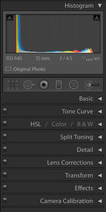
It seemed natural to start right at the top and work my way down. So that's what I did.
I went through each and every panel, from the "Basic" panel to the "Tone Curve" panel and all the way down to "Camera Calibration" panel.
It quickly became clear that this was not the way to go. I had so many questions. Did I really need to change those "clarity" levels? What about the tone curve? Should I use that even after I had adjusted the "highlights" and "shadows" in the basic panel?
After my "top to bottom" method failed miserably, I tried another method called "just-fix-whatever-looks-wrong." It was basically trial and error.
I would jump around the develop module, adjusting the settings based on whatever changes I felt the photo needed. But every time I "fixed" one issue with my photo, I caused other issues.
Building a Better Process
After I got more experience, two things became clear:
- If I didn't start with a clear idea of how I wanted my image to look, it would be impossible to edit it properly
- Some tools were more fundamental than others. It didn't make sense to fine tune until I got those right.
Based on these insights (and a lot of experimentation) I've honed an order and technique to my Lightroom editing. This is certainly more "art" than "science" but I roughly follow these steps whenever I'm editing my own images or building new presets.
Here are the steps I follow:
1. Visualize The Final Image
– Gather inspiration outside of Lightroom –
– Have a way to reference during editing –
2. Set the Foundation
– Camera Calibration Profile setup –
– Exposure and White Balance (rough) –
3. Tone Curve Magic
– Do as much as you can in the Tone Curve Panel –
– Use the Highlights/Shadows/Whites/Blacks settings sparingly –
4. H/S/L, Repeat
– Hue –
– Saturation –
– Luminance –
– Repeat –
5. Final Touches
Let's look at these steps a little closer...
1. Visualize the Final Image
Whatever you do, don't skip this step! You will be tempted to jump right into your photo and start editing away.
Don't.
If you don't have a clear idea of what you want the finished image to look like, your chances of getting that look are essentially zero. So deep breath. Take a moment. Visualize.
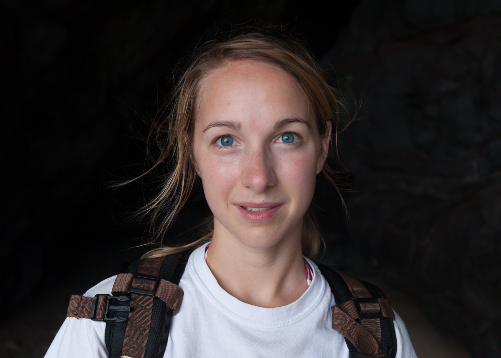
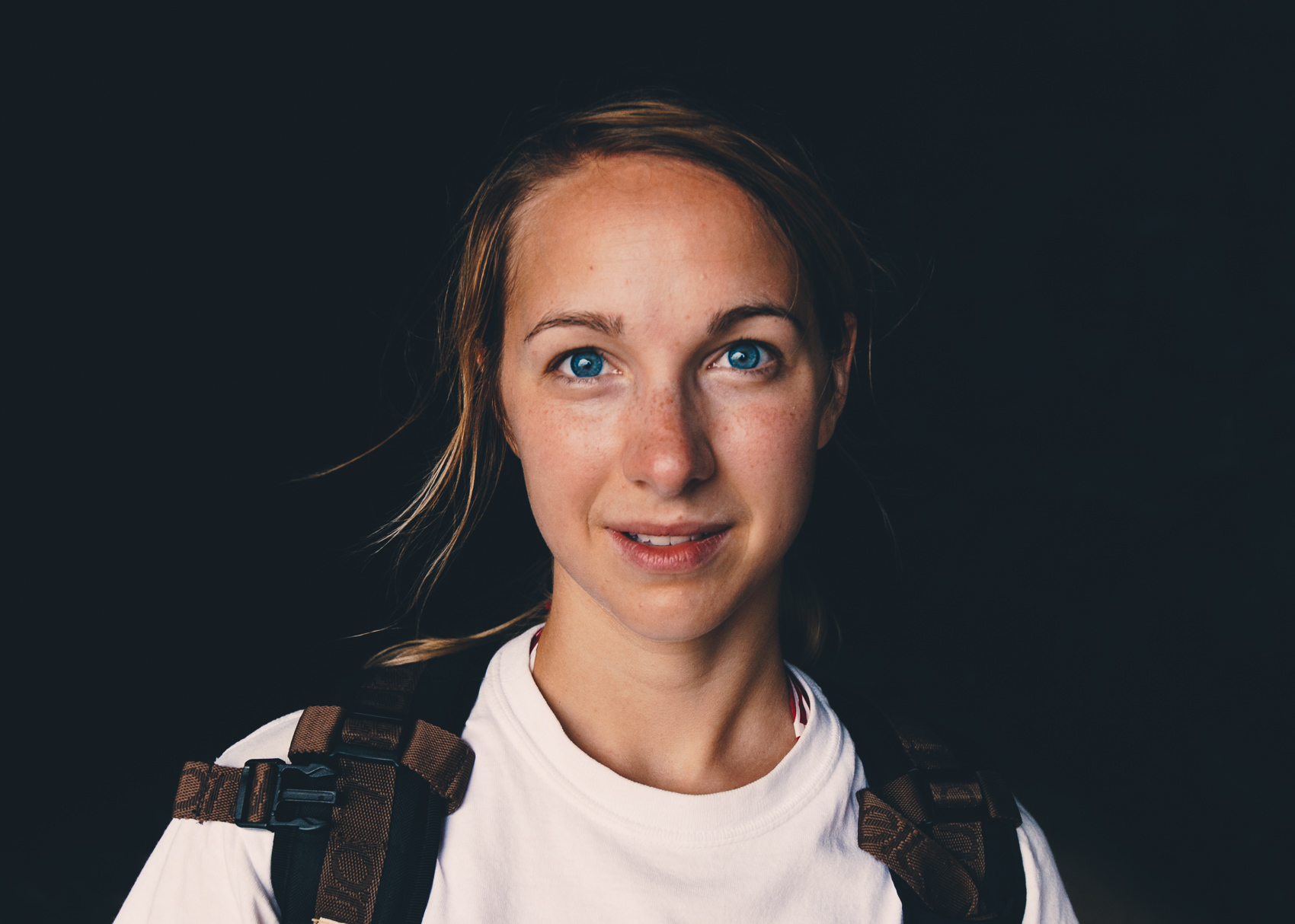
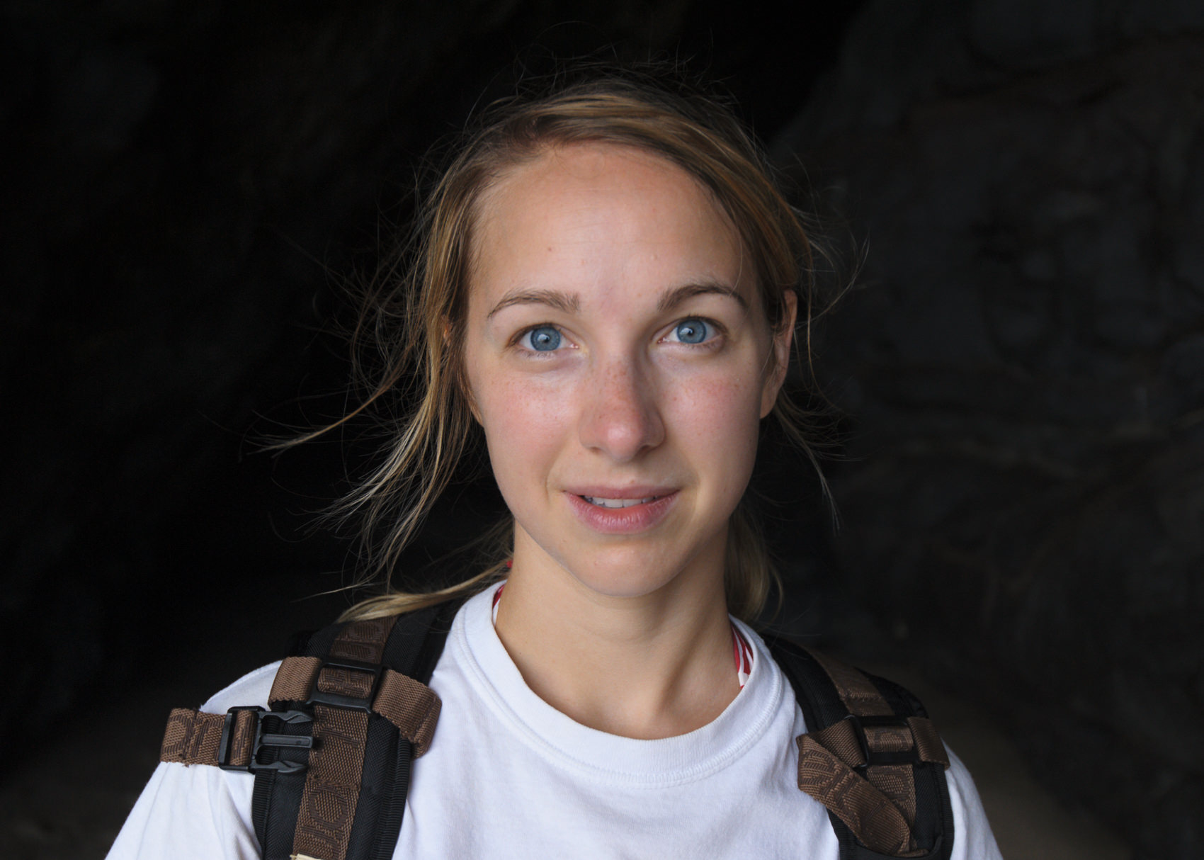
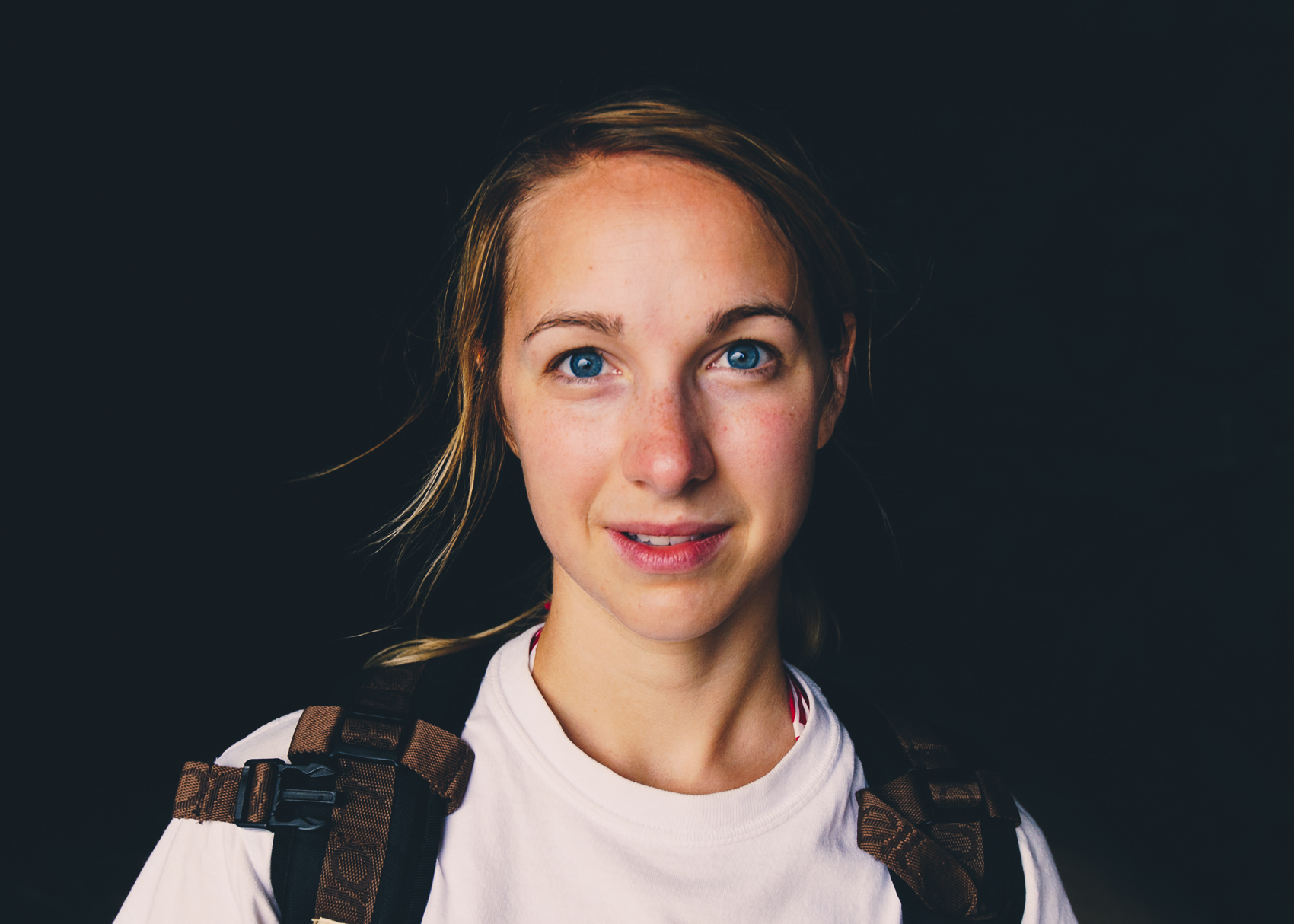
LEFT side: Straight in Lightroom. RIGHT side: After adjustments
For this particular photo, I had a very specific style in mind. I wanted a look that was warm, moody and dusty – like it belonged in the pages of National Geographic.
I gathered quite a number of reference photos for the look above. It's very important that you find visual inspiration. There are a number of places you can find inspiration:
- You can find photos on the web (like Instagram, Flickr or 500px) that have a look you want.
- You can reference the images of your favorite photographers.
- You can find sets of images taken by a certain film.
- You can find analog examples that you like. It could be the cover of that Anthropologie catalogue, or the pages of your old Nat Geo collection. Anything that inspires you!
Whatever it is, find an inspiration. And make sure to reference it, often. This is your compass, your True North. You need this to avoid getting so caught up in the world of your own image that you forget where you are headed.
2. Set the Foundation
Before we can really capture this look, we need to set the stage and put down a solid foundation.
A. Camera Calibration Profile
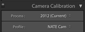
Counterintuitively, your first step in Lightroom begins all the way down at the very bottom of the Lightroom develop panel.
It's the Camera Calibration panel.
Camera Calibration Profiles are one of the MOST important components of Lightroom, assuming you shoot RAW (and you should). It is interpreting the RAW data into displayable colors. So if this is screwed up, it can be difficult to recover later.
For this image, I used the NATE Cam custom camera profile. This is something I built to correct for some of the weaknesses of the Adobe Standard profiles (such as it's weak, overly-magenta red tones). This is what my Professional-Grade Lightroom presets are being built on, and there are over 500 different profiles, each calibrated to a different camera model.
But if you don't have any of my preset packs with these profiles, I would recommend trying your "Camera Standard" profile and seeing if you like that better than Adobe Standard.
B. Exposure and White Balance (Rough)
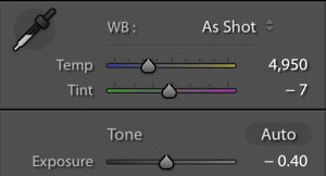
At this stage, you just want to try to get exposure and white balance approximately right. We'll be coming back and fine-tuning this later.
For this image, the exposure and white balance were fine as is. But it's a good idea to just make sure you are in the right ball-park here before you try to make too many edits.
LEFT side: Straight in Lightroom. RIGHT side: Applying NATE Cam - Camera Profile
Changing the camera profile here to a NATE Cam custom profile makes some subtle, but extremely important changes to underlying tone interpretation (particularly with red tones). It's difficult to see here, but trust me, as we develop this image, this subtle change will turn into an important one.
3. Tone Curve Magic Time
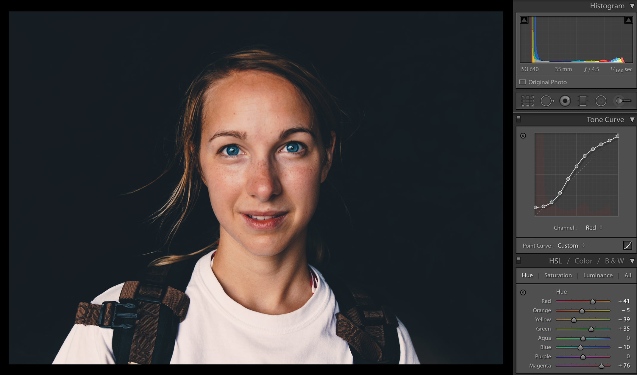
After setting the stage, I always go straight over to the tone-curve panel.
There is so much MAGIC crammed into this tiny module. Just when you think you have it figured out, you find more layers and more possibilities with it.
A. Adjusting the tone curve
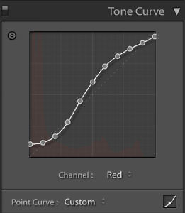
If you're just starting out in Tone-Curves, you'll want to start first with the "RGB" channel, which applies the tone curve evenly across all primary colors. Once you get more advanced with this, you'll learn how you can manipulate the individual color channels (Red, Green & Blue) to get just the right look (and I'm sure I'll write about this soon).
Want beautiful, warm fade in your shadows? It's easy once you understand tone curves. Want to add contrast just in the lower mid-tones? This is where you do that.
The major problem with this module is that grabbing those little pointy dots are SO... DAMN... HARD!!
I have some of my own super-secret methods for making better tone curves (hint: I do much of the leg-work outside of Lightroom), but you can start to gain more power over your images by getting better with this module.
This is one reason that high-quality presets are so rare (and so useful) – it takes a lot of time and expertise to carefully craft a great, channel-specific tone curve. If you had to do this for every image, you'd go bonkers!
B. Fine-Tuning Highlights, Shadows, Whites & Blacks
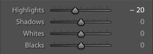
This module comes with a warning: be extra careful here!
The #1 mistake I see Lightroom beginners making is trying to do much in this module.
The problem with this module is that (1) it's right there at the top so beginners try it first and (2) it is just way too easy to make your images look over-processed. This module is the origin of bad HDR.
That's why I only use this module to achieve specific effects. And even then I'm super cautious. For this shot, the only thing I adjusted was bringing down the highlights slightly.
LEFT side: Before Tone Curve RIGHT side: After Tone Curve
OK, trust me with this: we've got this image right where we want it (even though the colors look wacky.) The fade and warmth looks great. It adds some mid-tone contrast and dimensionality to the skin. But the tone-curve has intensified some of our problems with the skin-hues (which is why we did this first!)
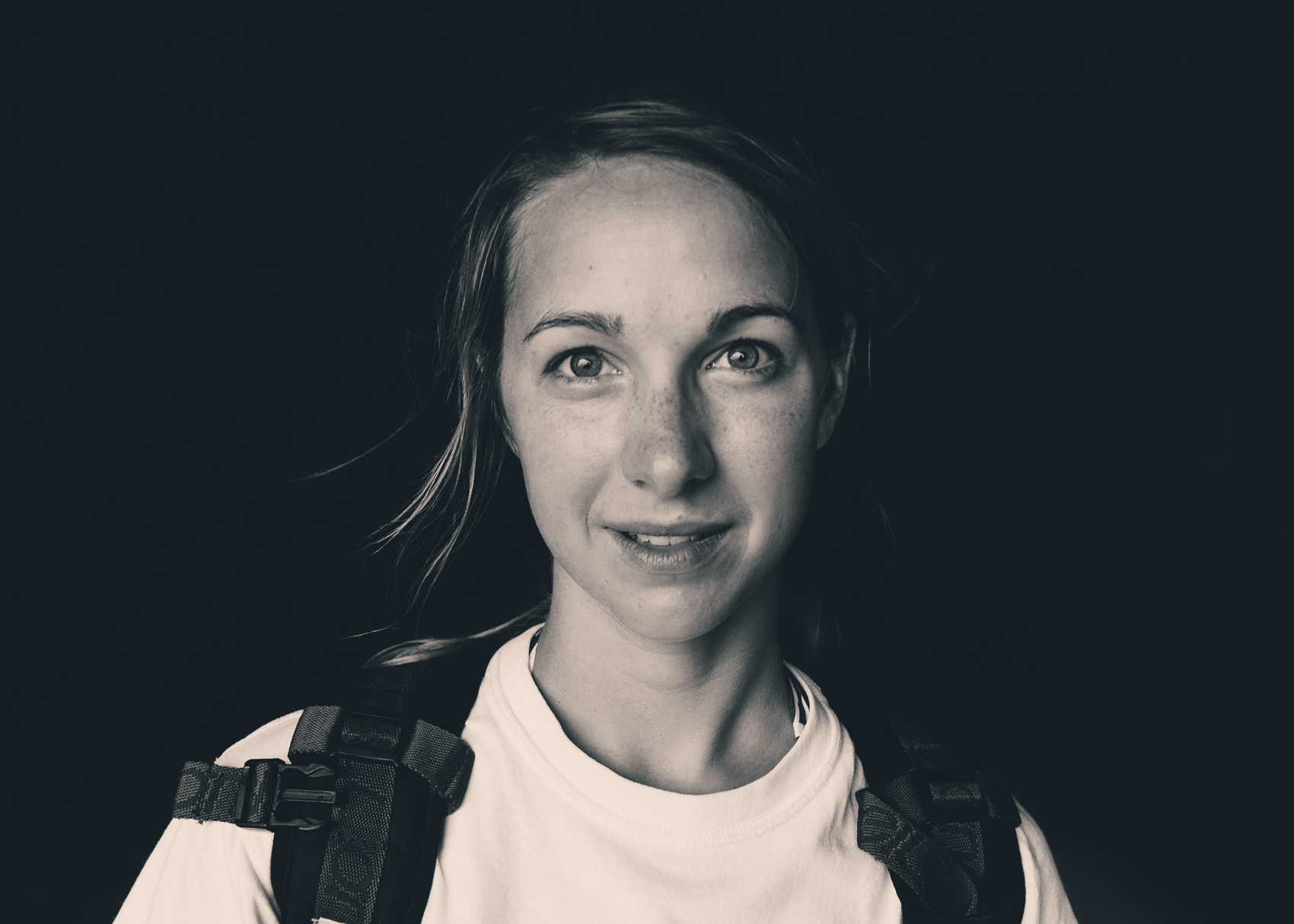
A helpful trick while you are working on the tone curve is to switch in and out of Black and White mode by hitting the "V" key on your keyboard. It's much easier to evaluate the contrast and fade this way. You can even see the tinting from your channel-specific curves coming through (which is kind of a cool effect in itself).
LEFT side: Before Tone Curve (b&w) RIGHT side: After Tone Curve (b&w)
Hitting "V" on our keyboard let's us switch to "Black and White" mode - where it is much easier to see that this is moving in the right direction. You can also see the tint of my channel-specific curves coming through - see how the lighter tones (like the skin and the white shirt) are warm, while the darker tones (like the background) is slightly teal?
4. Hue / Sat / Luminance Fun

Now this is where things get really fun. This is my second favorite panel (besides the Tone Curve panel). Again, it's just packed with so much potential.
A. Hue
The biggest problem with the photo right now (vs what I want it to look like) is in the hues.
Right now, the hues in the face span all the way from magenta (in the sunburn) to greenish yellow (in the shadows and hair). We want that to look more consistent. So we'll push the red hues towards orange, and pull the yellow hues also towards orange.
LEFT side: Before Hue Adjustments. RIGHT side: After Hue Adjustments.
Looking much better. Look closely at the skin and see how the magenta sunburn is gone. Also, look at how the hair has gone from a greenish-yellow to a golden-yellow. This is coming along nicely.
B. Saturation
The image still looks a bit overly saturated for the look I'm going for. I start by bringing the saturation down globally, then going into the Saturation setting in the H/S/L panel. For this look, I brought down green significantly just to snip out any green tones that may be lingering in the skin.
LEFT side: Before Saturation Adjustments. RIGHT side: After Saturation Adjustments.
The reduced saturation looks much more natural. We are almost there!
C. Luminance
Luminance adjustments are one of the most under-rated tools in Lightroom. You can get some really powerful effects in this panel that you might think you would get elsewhere.
Here, I wanted to replicate the "high-fidelity" film look popularized by National Geographic.
By bringing down the luminance of the warm tones (Red, Orange and Yellow), it's almost like we have a polarizing filter just for the skin. It gives the skin a much more "textured" look. You can see all the details you couldn't before, yet it doesn't look fake or HDR.
Then, to make the eyes "pop" just a bit more, I increase the luminance in the blue and aqua channels just enough to make them glow.
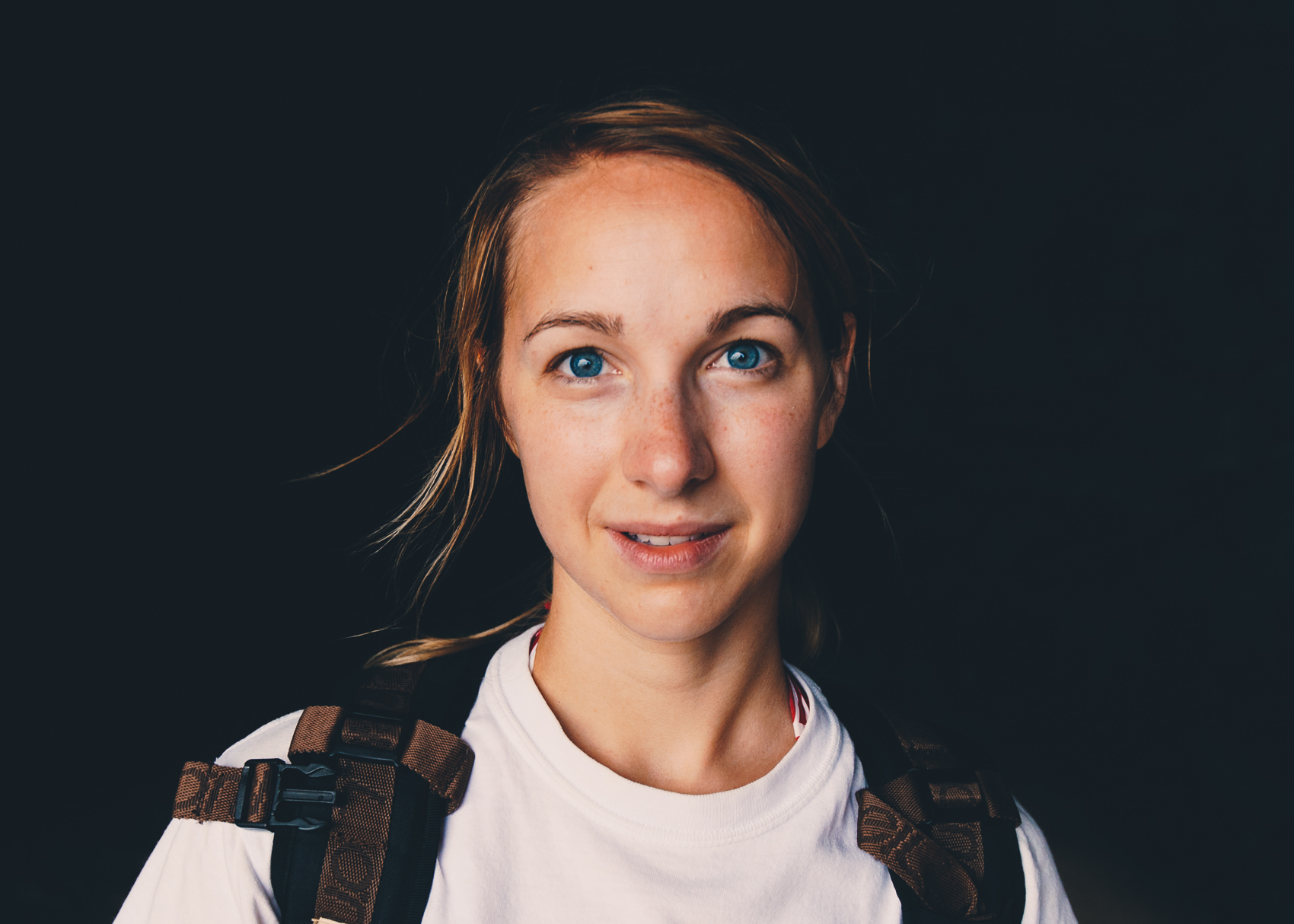
LEFT side: Before Luminance Adjustments. RIGHT side: After Luminance Adjustments.
The image would work perfectly well without luminance adjustment. It has a nice "glow" that you may want sometimes. But I really love the deep textured look we get here by bringing the luminance down. It all just depends on the look you want!
D. Repeat
Getting just the right look in the HSL panel isn't easy because there is so much interplay between the three. You'll find that as you adjust the luminance, you'll need to also adjust the saturation (and vice-versa).
That's normal. Take as much time as you need! Keep working it. Getting everything just right for this photo didn't happen overnight. It was years of learning and developing. So keep at it!
5. Final Touches

Now that you've done the hard work, it's time for the last few adjustments.
Exposure & White-Balance
Fine-tune these. See if your image would benefit from a small increase or decrease in exposure.
Split Toning
You probably don't need this
Detail
Avoid the urge to over-sharpen now. You'll want to be sure to add sharpening during your final image output so that your image is sharp at final resolution.
Lens Correction
Go ahead and try the lens correction. If you don't like it, don't feel the need to use it.
Transform
Only use this if you are trying to get a specific geometric effect.
Effects
I like to add a touch of grain to add depth, but just depends on final destination. For instance, in smaller formats (like Instagram) I typically don't add grain.
Your Turn!
Go ahead and try this out on the next set of images you process. There's some learning curve involved (especially with the tone curves), but once you get the hang of this, you'll never be asking yourself which panel you should be adjusting next!
Also, don't feel like you have to follow this recipe rigidly. You can jump between any Lightroom settings you'd like. But this framework helps me get into a healthier and more productive pattern of development, and I hope it will help you, too!
Oh yeah! I should mention that if you want this exact look, it's available as the EX04 preset from the E-Chrome Collection 🙂


Well… That’s really helpfull – thanks.
Very informative and well written. I look forward to using this technique!
Cheers dude! Appreciate the emails and tutorials
Helpful as always! Thanks, Nate!
It’s a well-detailed process. I will surely apply this when I am going to edit photos.
Great article! You aren’t mentioning presets here, VSCO in particular. When in your process do you prefer using these?
I know that the Idea with VSCO is to be able to adjust WB and Exposure both before and after applying their presets to an image. So to me it sounds like a preset would replace the parts of your flow not including camera calibration, WB and Exposure?
Great question, Noel. Yes, this article is mainly about my process for creating new looks. When I’m batch-editing images, I always use presets (either my own NATE cam presets, or VSCO Film). Here’s roughly my flow:
1. Visualize the type of look I want for these images (still an important step)
2. Determine which presets I think will help achieve this (there’s still some trial and error involved, but it helps dramatically to try and narrow down before just trying every preset you have).
3. I then have my own set of presets for making common secondary adjustments to tone (which I’ll make available soon).
4. I’ll then roughly follow steps 3-5 just to fine tune any issues, but usually adjustments at this point are minimal.
Hope that helps!
-Nate
Thanks. This helps greatly. I really enjoy your easy approach and readability. Keep it up.
Eagerly awaiting the upcoming and awesome VSCO film pack guides from you :-).
Thanks, Nate! I had the exact same question! Can’t wait for your new CAM pack!
Thanks, how can I sign up to be emailed about your new posts?
Hey! Whoops, I should probably add an easier way to do this… in the meantime, if you download my NATE Cam Starter Pack (http://natephotographic.com/vsco-cam-lightroom-presets-starter-pack/), it will put you in my email (and you’ll get some great free presets!)
Thank you for this informative tutorial. I will definitely be reevaluating my processing procedures. I enjoyed your style of writing. More like a friend giving you hints rather than an expert axpou ding on what makes them soon awesome.
Awesome, that’s exactly what I’m going for! 🙂
-Nate
I LOVE LOVE LOVE YOUR SITE! and your advice. I am in the process of starting my own website and I was wondering what that Before and After tool is called?
Aww, thanks so much! The website is built in WordPress, and the before/after slider is a plugin called “TwentyTwenty” – you can find it here: https://wordpress.org/plugins/twentytwenty/
-Nate
Hey Nate,
I absolutely love your presets and use A6 and M5 all the time. I can tell a lot of the magic happens in the individual rgb curves, and you said that you might write an article about it. I wanna start getting into making my own presets for myself with unique colors and tones, and the other develop modules dont seem to be able to give me enough control. Do you have any reccomendations of where to start to master curves. Thanks
That’s awesome! I’m actually working on a video tutorial, which will include super in-depth my process for mastering curves. It will go up on pre-sale next week, and be ready before end of year. I will say this – it helps to have a strong understanding of what the curves are technically doing, understanding the curves of analog film (from the film’s technical info), understanding the curves of the paper film was printed on, and a strong understanding of color theory. I will also say that I haven’t seen anyone else using the same exact process / tools that I do.
Thank you sir.
Thanks so much! I’ve been wanting to experiment with creating my own presets and this was a great tutorial for getting a solid foundation in place. I used this process to edit some photos last night and was really happy with the result! Cheers!
well thanks Nate!
awesome nate
As someone who is new to lightroom (I’ve had it about 5 months) I found this VERY helpful and also realized that I have been making many of the mistakes you mentioned. So glad I found this, thank you! https://www.facebook.com/jamieleonardphotography/
Appreciate the information Nate, looking forward to applying it to my own work.
Thank you !
This is freaking awesome, happy I stumbled on your blog!
You are a fucking genius!
Thanks for these wonderful recomendations.
You’re the best Lightroon teacher! 😀
Regards from Argentina